
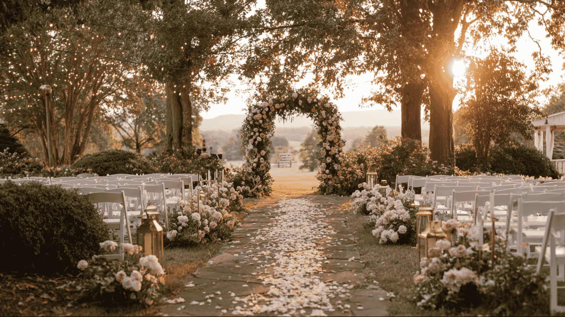
Close your eyes for a second and picture your wedding day. What comes to mind first? For most couples, it is not the cake or the chairs. It is the colors.
Color is the first thing your guests notice when they walk in. It sets the mood for the day. And it shows up in every single photo you will look back on for years.
That is why wedding color schemes deserve a little extra thought. The right palette pulls your flowers, outfits, table, and decor together into one story that feels like yours.
One place where this really shows up is in your ceremony backdrop. Even simple setups like these wedding arch designs that match your color palette can pull everything together beautifully.
Why Does a Wedding Color Scheme Matter?
A wedding color scheme is a curated selection of two to four colors that run consistently across every visual element of your wedding, from florals and attire to stationery and decor.
Color is the single most powerful design decision you will make during wedding planning. It sets the emotional tone of your entire celebration before a single guest sits down.
Soft dusty blue and blush whisper romance and serenity. Deep emerald and gold command luxury and drama. Warm terracotta and rust create earthy, intimate warmth. Your palette ties every element into one cohesive, intentional visual story.
Choose wisely. Your colors will live in your wedding photographs forever.
Classic and Everlasting, Wedding Color Schemes
Some wedding color ideas never go out of style. These classic palettes have stood the test of time, graceful, polished, and guaranteed to look stunning in every photo.
1. White and Gold Wedding Color Scheme
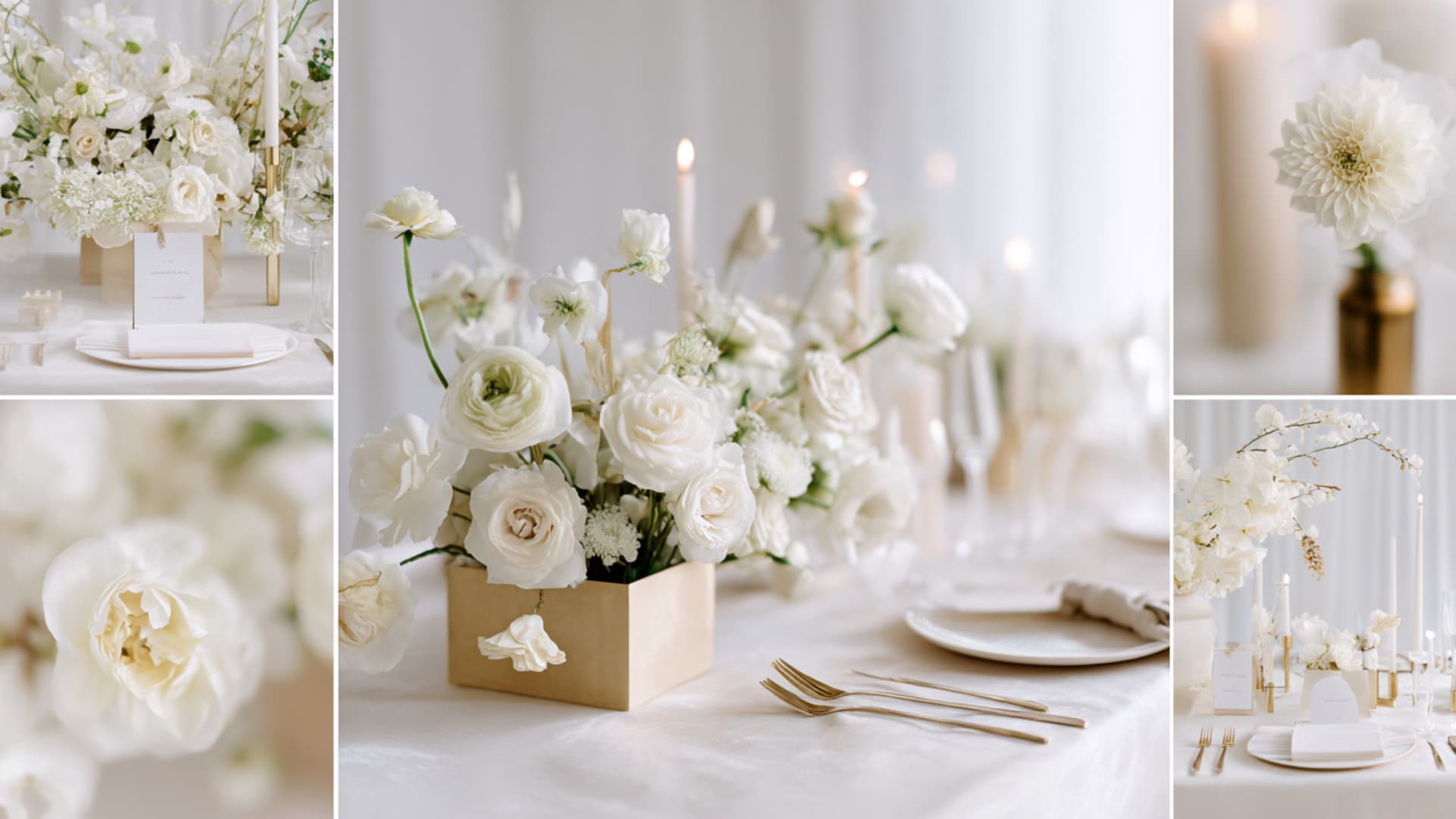
White and gold are the ultimate symbols of luxury and refinement. Crisp white florals against gold candelabras, gilded charger plates, and ivory table linens create a wedding that feels effortlessly grand.
You will often see this palette carried into table styling through white florals and metallic accents, much as it appears in elegant centerpiece setups. It photographs exceptionally well under warm lighting, giving every image a soft, editorial quality that feels timeless rather than trendy.
Pro Tip: Swap stark white for warm ivory; it flatters every skin tone.
2. Black and White Wedding Color Scheme With a Red Accent
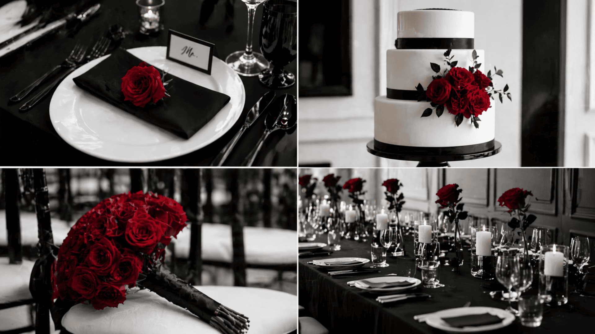
Black and white is bold, cinematic, and endlessly sophisticated. Adding a single red accent, through florals, ribbon details, or the groom’s boutonnière, injects just enough passion and drama without overwhelming the palette.
This combination suits urban venues, industrial spaces, and formal evening receptions perfectly. It is one of the few wedding color combinations that photographs equally well in color and black-and-white film.
Pro Tip: Use red only in florals; too much red overwhelms the palette.
3. Navy Blue and Champagne Wedding Color Scheme
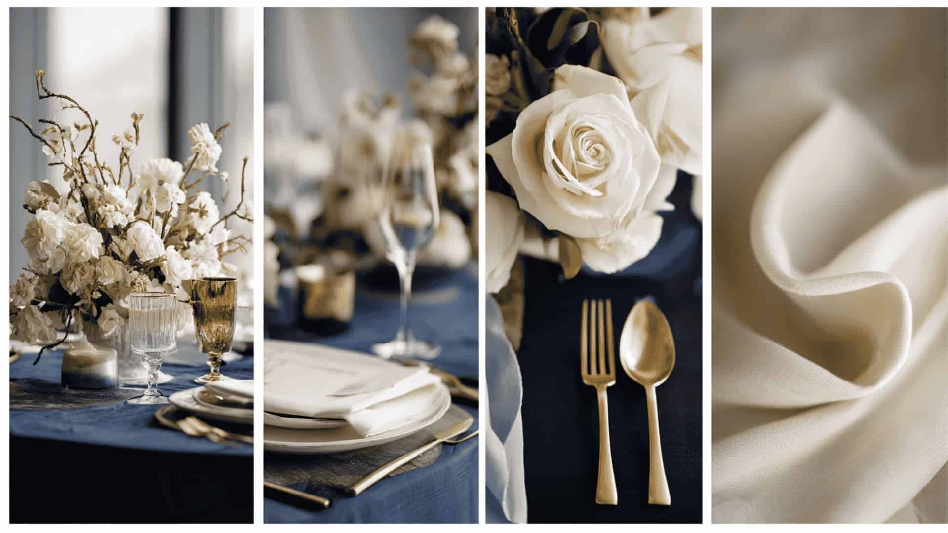
Navy and champagne are the grown-up, polished alternative to the classic black-and-white wedding. Deep navy creates a rich, moody backdrop while champagne tones, in linens, glassware, and metallic accents, bring warmth and light back into the space.
This palette transitions effortlessly from a spring garden ceremony to a winter ballroom reception, making it one of the most versatile classic wedding color ideas available.
Pro Tip: Gold cutlery against navy linen enhances even the simplest tablescape.
4. Ivory and Blush Wedding Color Palette
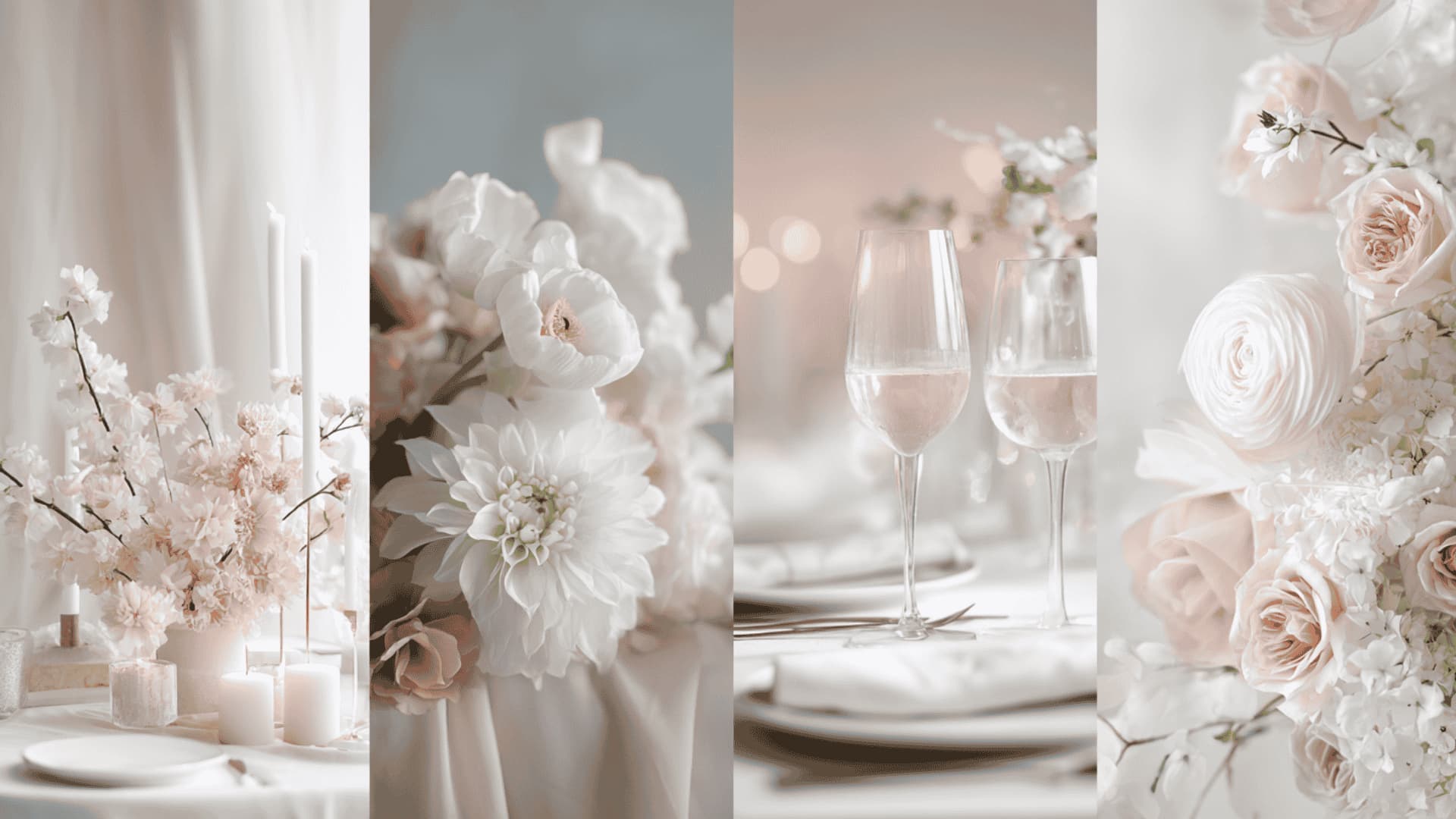
Soft, romantic, and feminine, ivory and blush are the palettes brides have loved for decades, and for good reason. Layering three shades of blush, from pale pink to dusty rose to deep mauve, adds dimensional depth to florals and centerpieces.
Ivory keeps the palette grounded and sophisticated, preventing it from feeling overly sweet. This is an ideal choice for garden weddings, vineyard ceremonies, and intimate indoor receptions.
Pro Tip: Layer three blush shades in florals for stunning dimensional depth.
5. Burgundy and Rose Gold Wedding Color Scheme
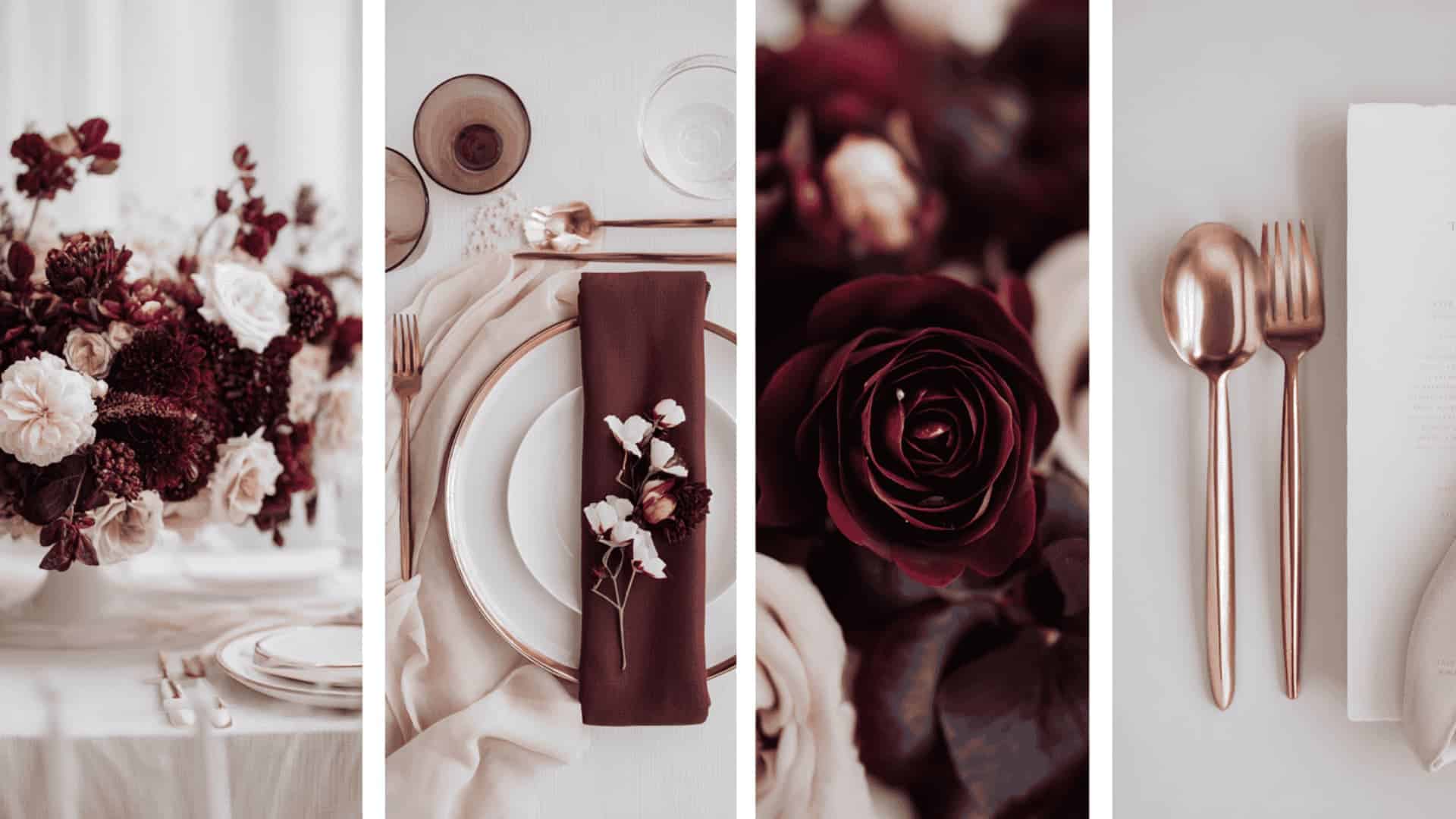
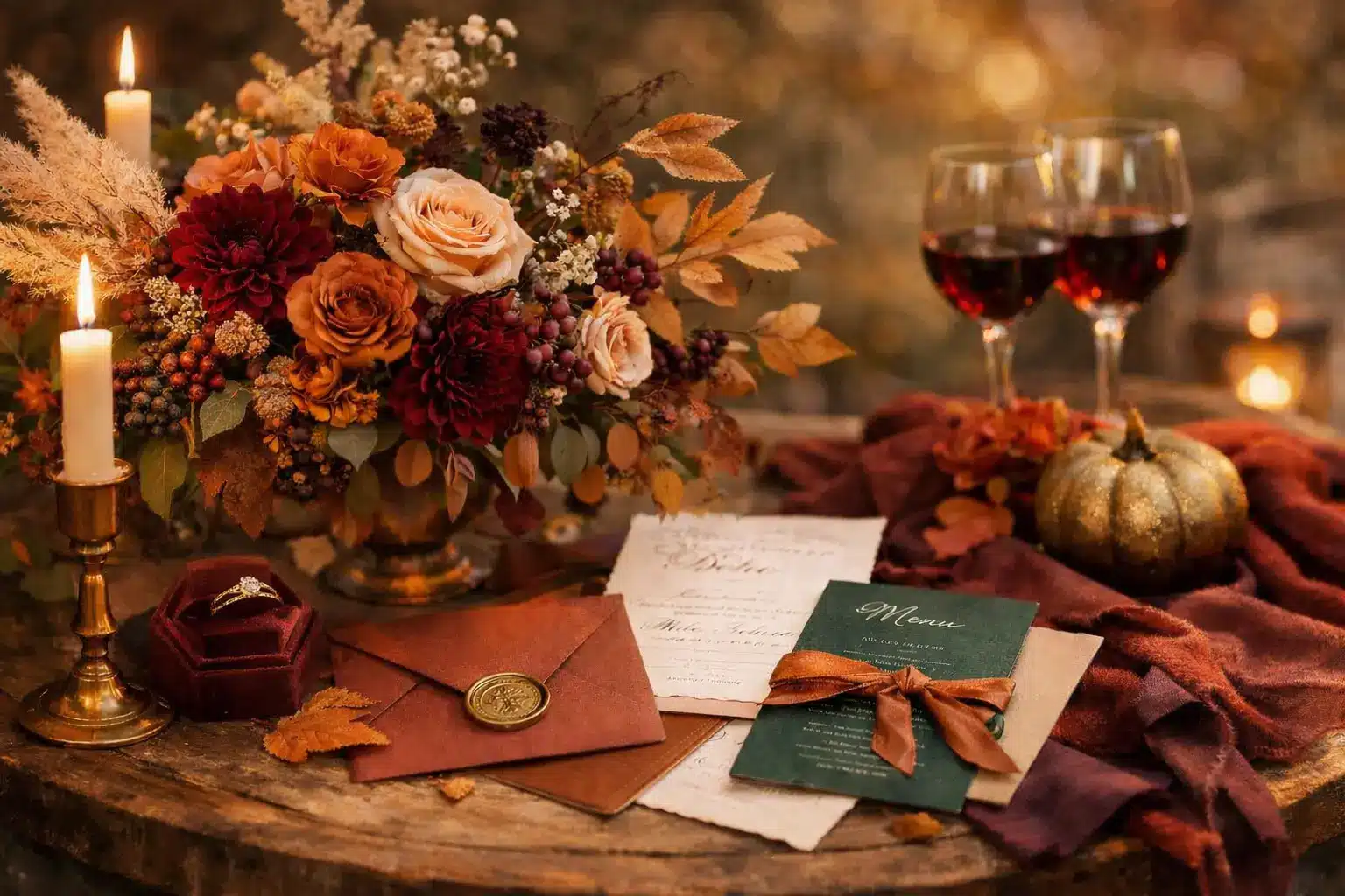
Burgundy and rose gold are rich, romantic, and undeniably glamorous. The deep wine tones of burgundy add drama and intensity, while rose gold accents in charger plates, candle holders, and stationery soften the palette with a warm, modern metallic glow.
This combination works exceptionally well for autumn and winter weddings but translates just as beautifully into a summer evening reception under string lights and candlelight.
Pro Tip: Rose gold charger plates tie burgundy florals together without overpowering them.
Spring Wedding Color Ideas
Spring is all about fresh beginnings, blooming florals, and soft natural light. These spring wedding color schemes capture the season’s effortless beauty; romantic, airy, and absolutely stunning in outdoor settings.
6. Dusty Blue and Blush Pink Wedding Color Scheme
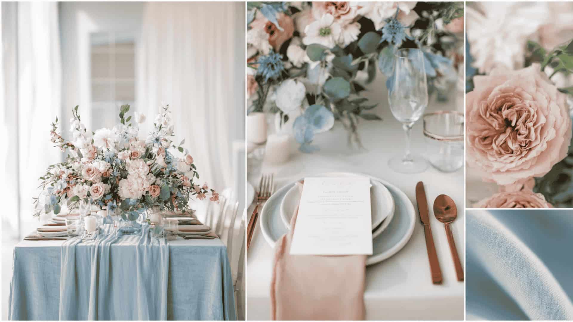
Dusty blue and blush pink are the most-loved spring wedding palette for good reason. The muted, weathered quality of dusty blue brings a quiet sophistication, while blush pink adds warmth and romance.
Together they create a dreamy, garden-party aesthetic that works beautifully with eucalyptus greenery, ranunculus blooms, and soft candlelight. This palette photographs exceptionally well in natural daylight, giving every image a soft, painterly quality.
Pro Tip: Add eucalyptus garlands to instantly bring freshness and botanical depth.
7. Lavender and Sage Green Wedding Color Scheme
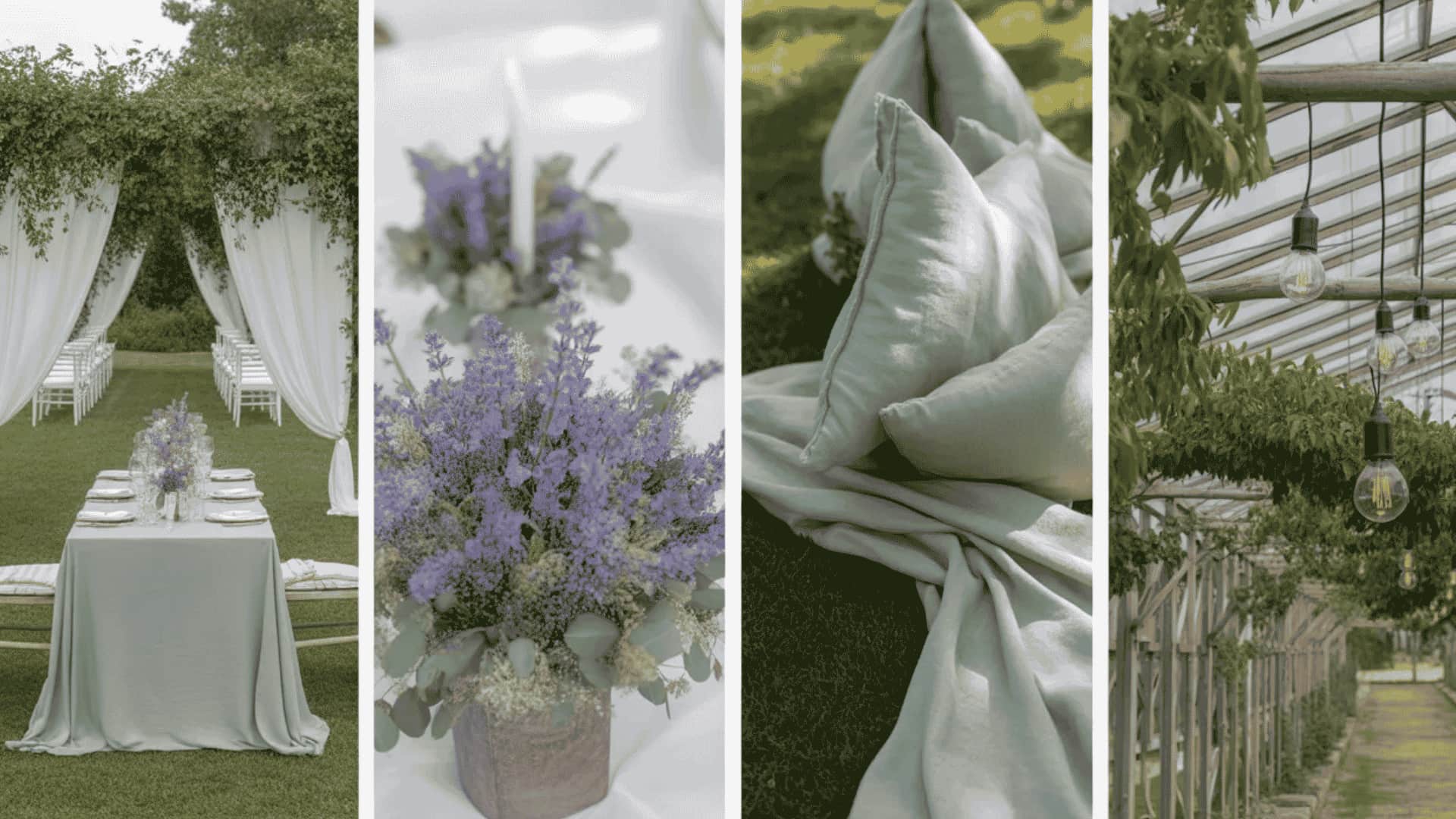
Lavender and sage green are nature’s own color combination, and it shows. Lavender brings a gentle, whimsical romance while sage green grounds the palette with an earthy, organic calm.
This pairing suits outdoor garden ceremonies, greenhouse receptions, and vineyard weddings perfectly. Linen bridesmaid dresses in sage with lavender bouquets create a relaxed, effortlessly elegant bridal party look that feels fresh without trying too hard.
Pro Tip: White taper candles between sage runners prevent the palette from feeling too flat.
8. Lilac Mist and Soft Gold Wedding Color Palette
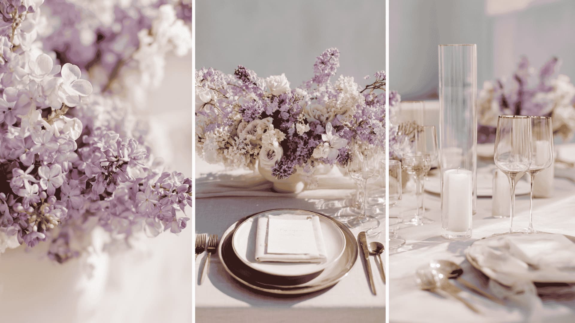
Lilac mist is the softer, dreamier cousin of bold purple, and paired with soft gold, it becomes truly magical. This palette layers delicate lilac blooms with gold-leaf stationery, champagne glassware, and ivory table settings to create a spring wedding style that feels both ethereal and luxurious.
It works especially well for daytime receptions where natural light can bring out the subtle shimmer of gold accents throughout the venue.
Pro Tip: A lilac ombre wedding cake with gold leaf is pure social media gold.
9. Butter Yellow and Lavender Wedding Color Ideas
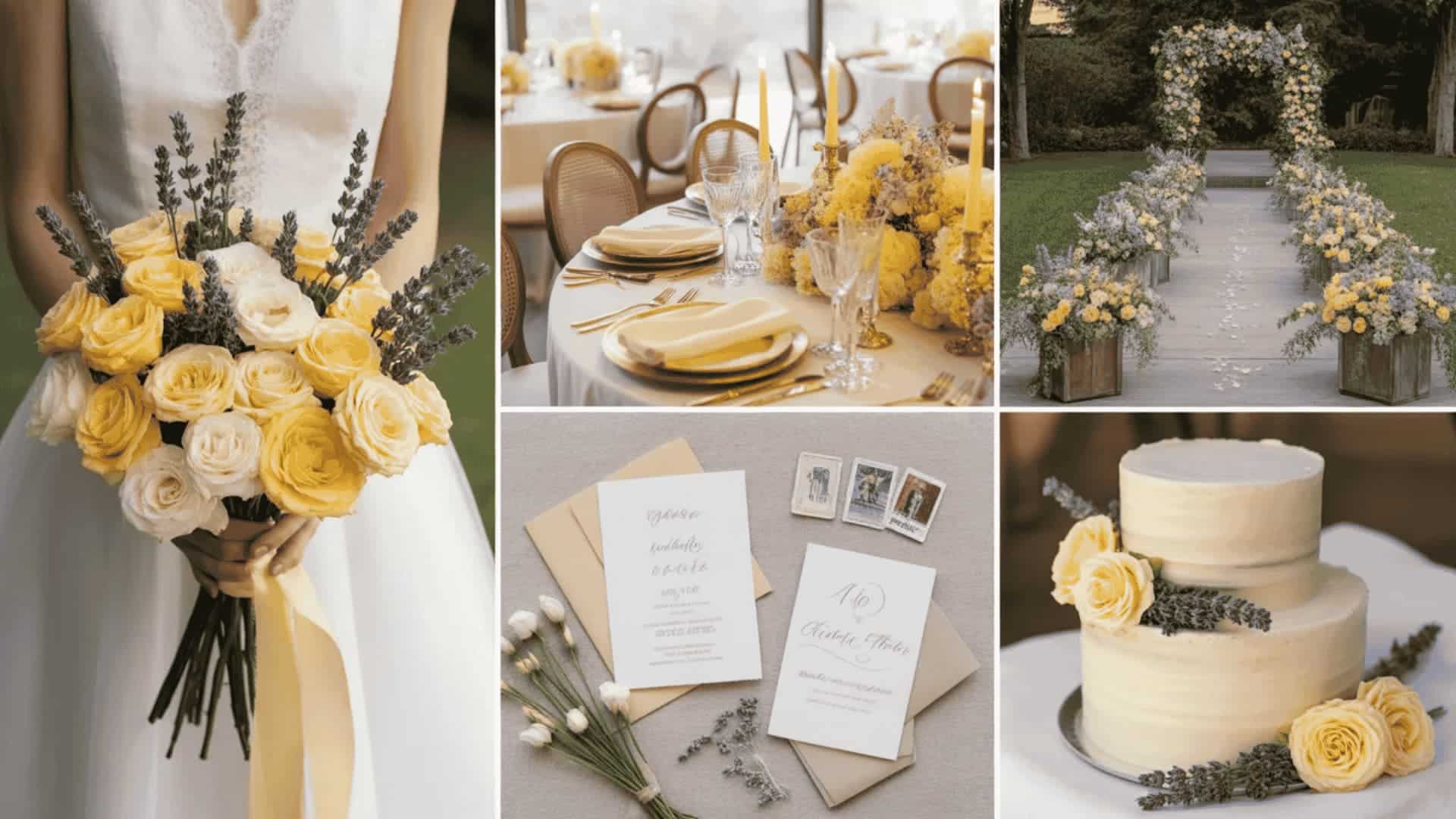
Butter yellow and lavender are a joyful, unexpected pairing that radiates warmth and optimism. Soft sunshine-yellow florals paired with lavender bridesmaid dresses create a color story that feels fresh, modern, and utterly cheerful.
This palette is tailor-made for outdoor spring ceremonies where golden-hour light transforms every yellow bloom into something luminous. It is light-hearted without being juvenile, and romantic without being predictable.
Pro Tip: Schedule portraits at golden hour; this palette glows like nothing else.
10. Mint Green and Peach Wedding Color Scheme
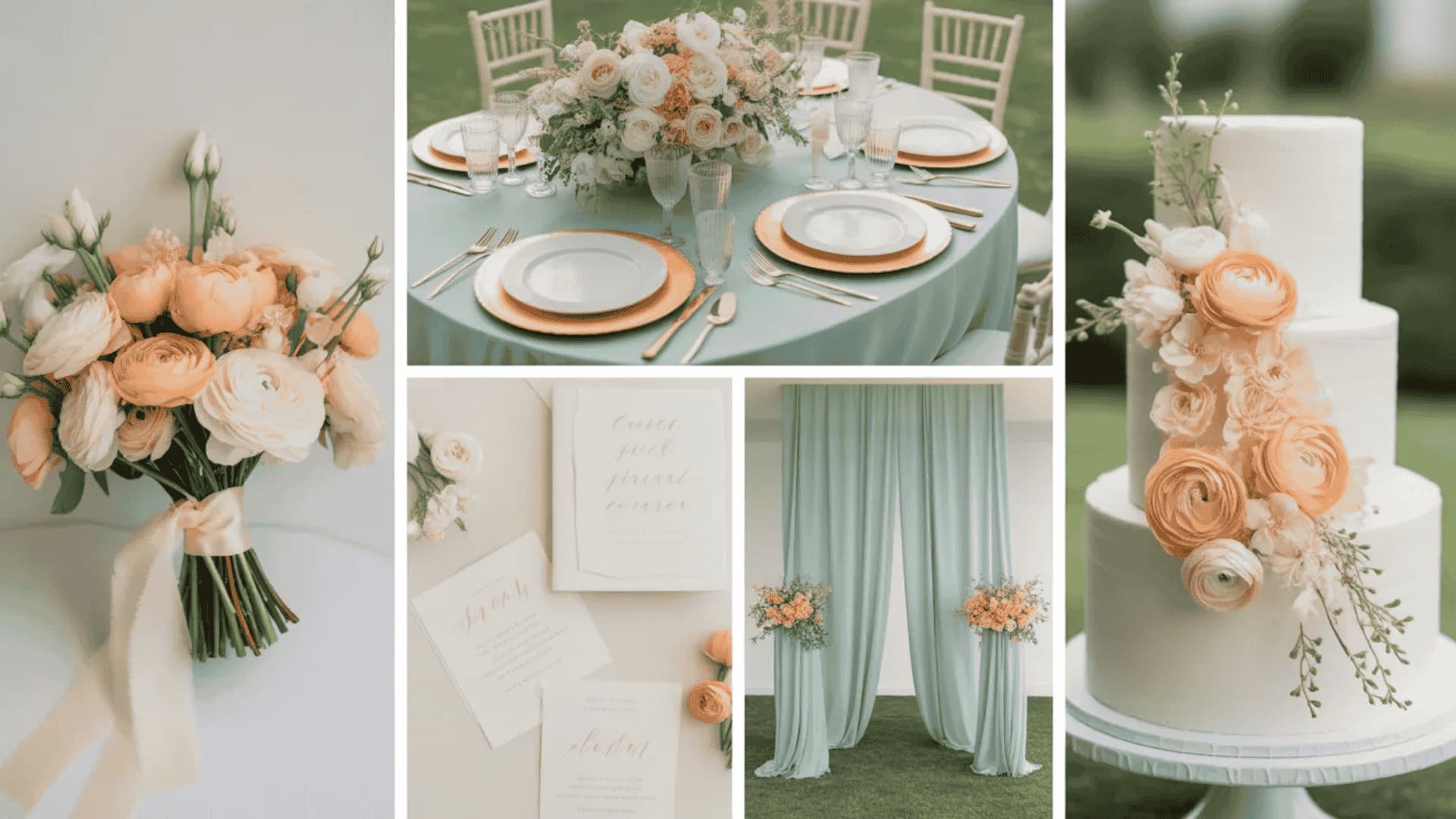
Mint green and peach are playful, fresh, and quietly charming. Peach florals bring warmth and softness, while mint green, in linens, bridesmaid dresses, or ribbon details, adds a cool, crisp contrast that keeps the palette feeling light and springlike.
This combination suits outdoor garden receptions, conservatory venues, and beach ceremonies beautifully. It is one of those rare wedding color ideas that feels equally at home in rustic and contemporary settings.
Pro Tip: Use peach in florals and mint in linens; never reverse the two.
11. Soft Coral and Cream Wedding Color Scheme
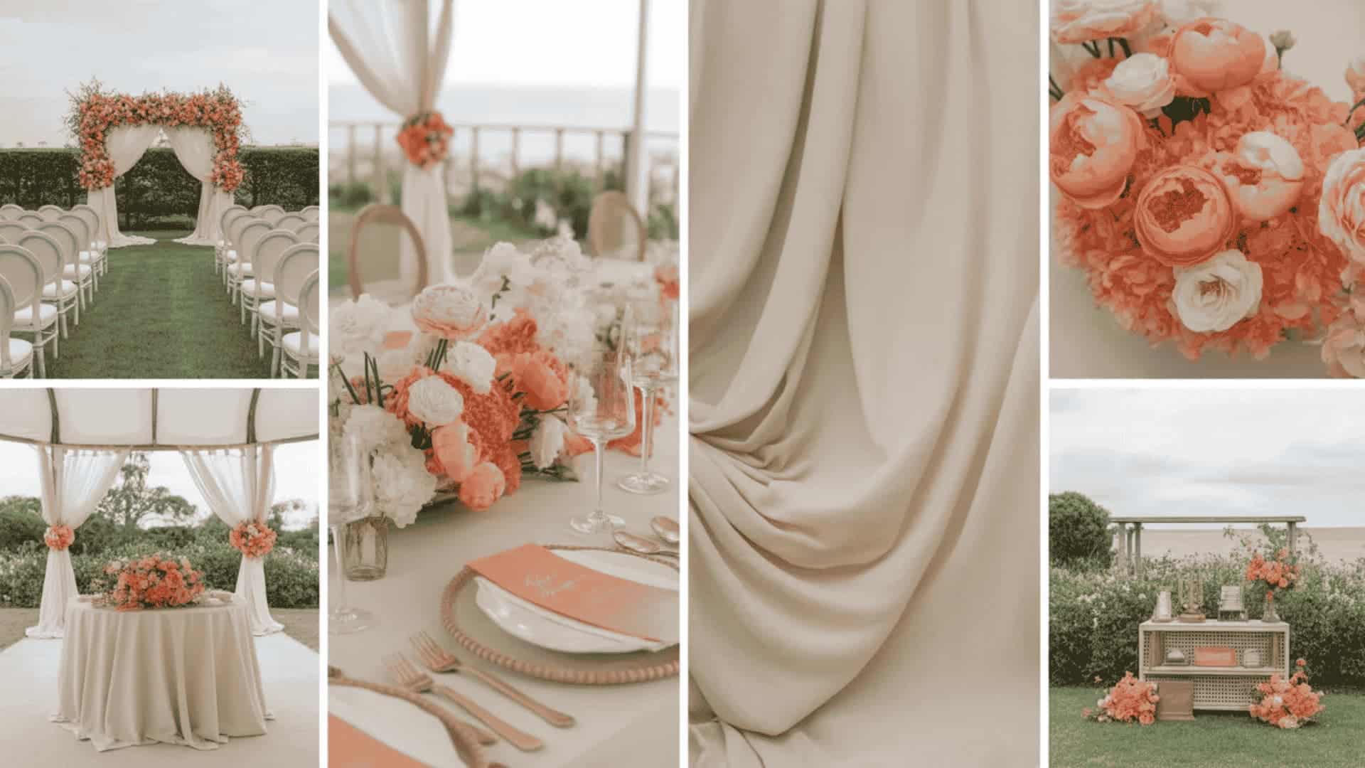
Soft coral and cream are warm, romantic, and deeply flattering against every skin tone. Coral brings a sun-kissed vibrancy that lifts an all-cream palette from simple to striking, without crossing into bold or overwhelming territory.
This combination works brilliantly for outdoor spring and summer weddings, coastal ceremonies, and bright, light-filled venues.
Pro Tip: Cream bridesmaid dresses in mixed silhouettes unify any bridal party beautifully.
Summer Wedding Color Schemes
Summer weddings are bold, sun-drenched, and full of life. These summer wedding color schemes give the season a vibrant energy, from tropical brights to warm Mediterranean tones that glow beautifully outdoors.
12. Cherry Red and Ivory Color Scheme
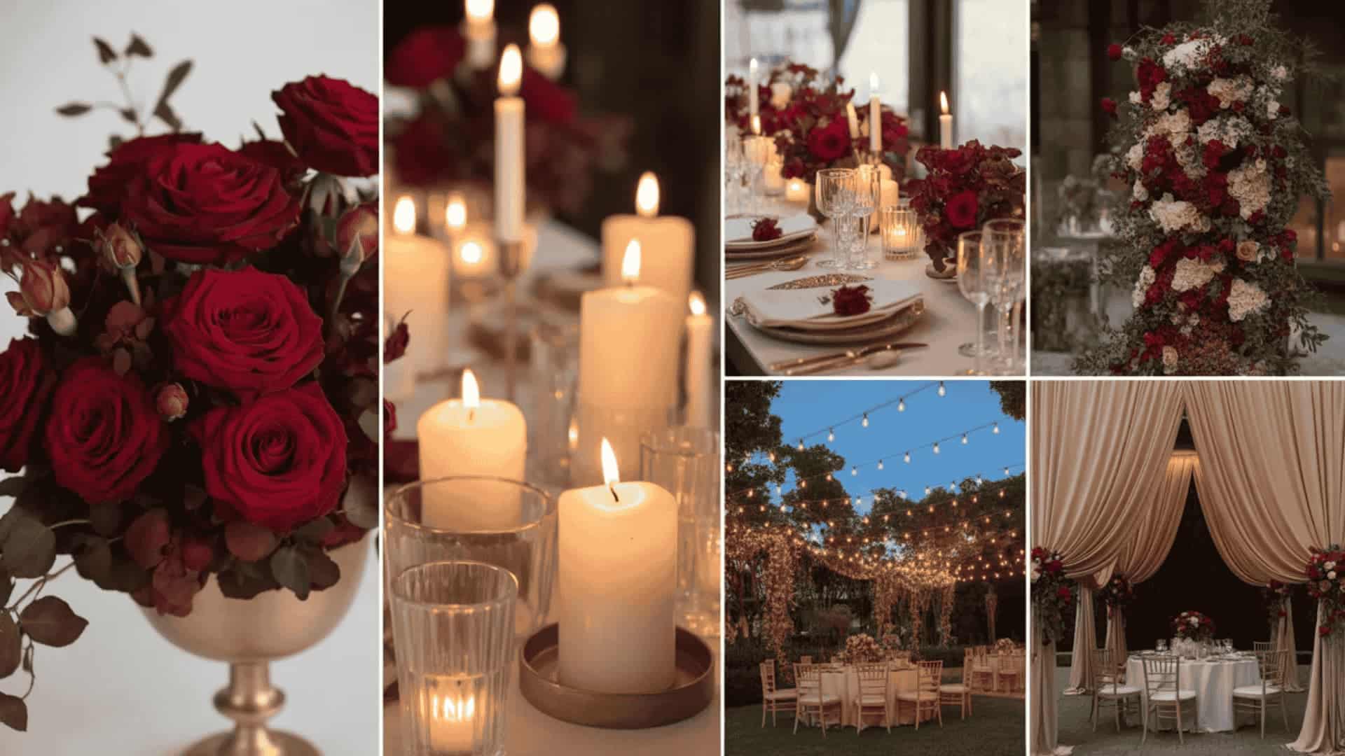
Cherry red and ivory is one of the boldest, most romantic wedding color combinations. Deep, velvety red roses against clean ivory table settings create a dramatic contrast that is neither dark nor heavy.
This palette suits evening receptions beautifully, where candlelight deepens the red tones into something truly luxurious. It works equally well in grand ballrooms, rustic barns, and outdoor marquees dressed with string lights and greenery.
Pro Tip: Keep floral stems long; tall cherry-red arrangements photograph incredibly dramatically.
13. Cobalt Blue and White Palette
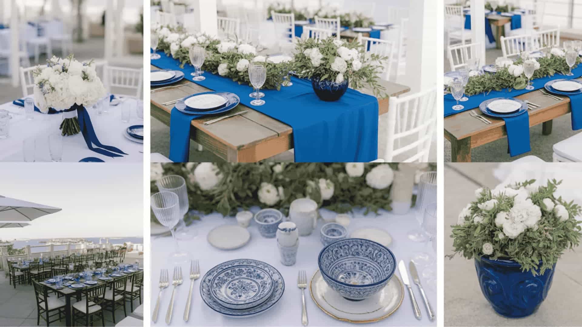
Cobalt blue and white are crisp, striking, and effortlessly chic. Inspired by sun-soaked Mediterranean coastlines, this palette brings an energetic, summery confidence to any wedding setting.
This combination works especially well for outdoor daytime receptions, rooftop venues, and destination weddings with an open sky as the backdrop.
Pro Tip: Blue-painted terracotta pots as centerpieces nail a Mediterranean look affordably.
14. Terracotta and Rust Boho
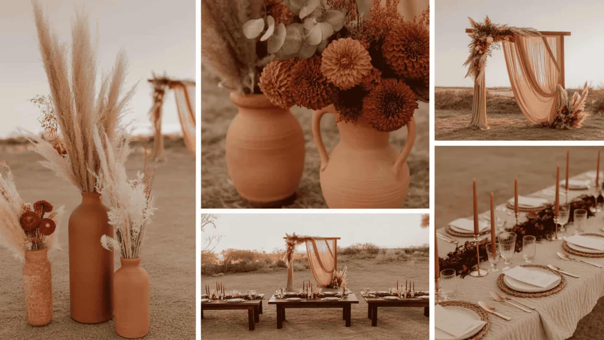
Terracotta and rust are earthy, warm, and completely on-trend for summer. These sun-baked, nature-inspired tones bring an organic intimacy to outdoor ceremonies and bohemian receptions.
Dried pampas grass, protea blooms, and trailing greenery complement this palette beautifully, creating a laid-back luxe aesthetic that feels both effortless and intentional.
Rust-toned bridesmaid dresses paired with beige linen suits for groomsmen complete the cohesive, earthy wedding color story perfectly.
Pro Tip: Dried pampas grass in terracotta urns photographs beautifully and costs very little.
15. Verona Sunset: Orange, Coral, and Warm Blush
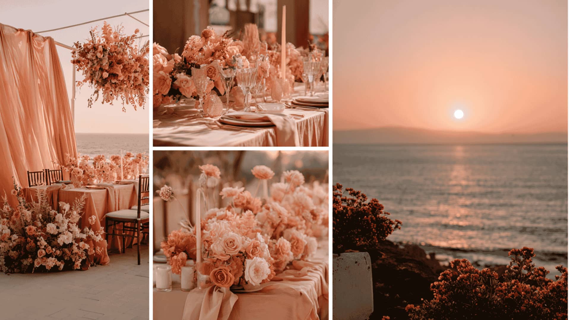
Named after the romantic backdrop of Shakespeare’s Romeo and Juliet, the Verona Sunset palette captures the warmth and passion of an Italian evening sky.
Vibrant orange, soft coral, and warm blush layer together to create a wedding color palette that feels richly Mediterranean and deeply romantic.
This combination suits destination weddings, outdoor summer receptions, and late-evening ceremonies, where the natural light enhances every warm tone.
Pro Tip: Host a cocktail hour at sunset, and the sky becomes your most stunning décor.
16. Tropical Green and Fuchsia
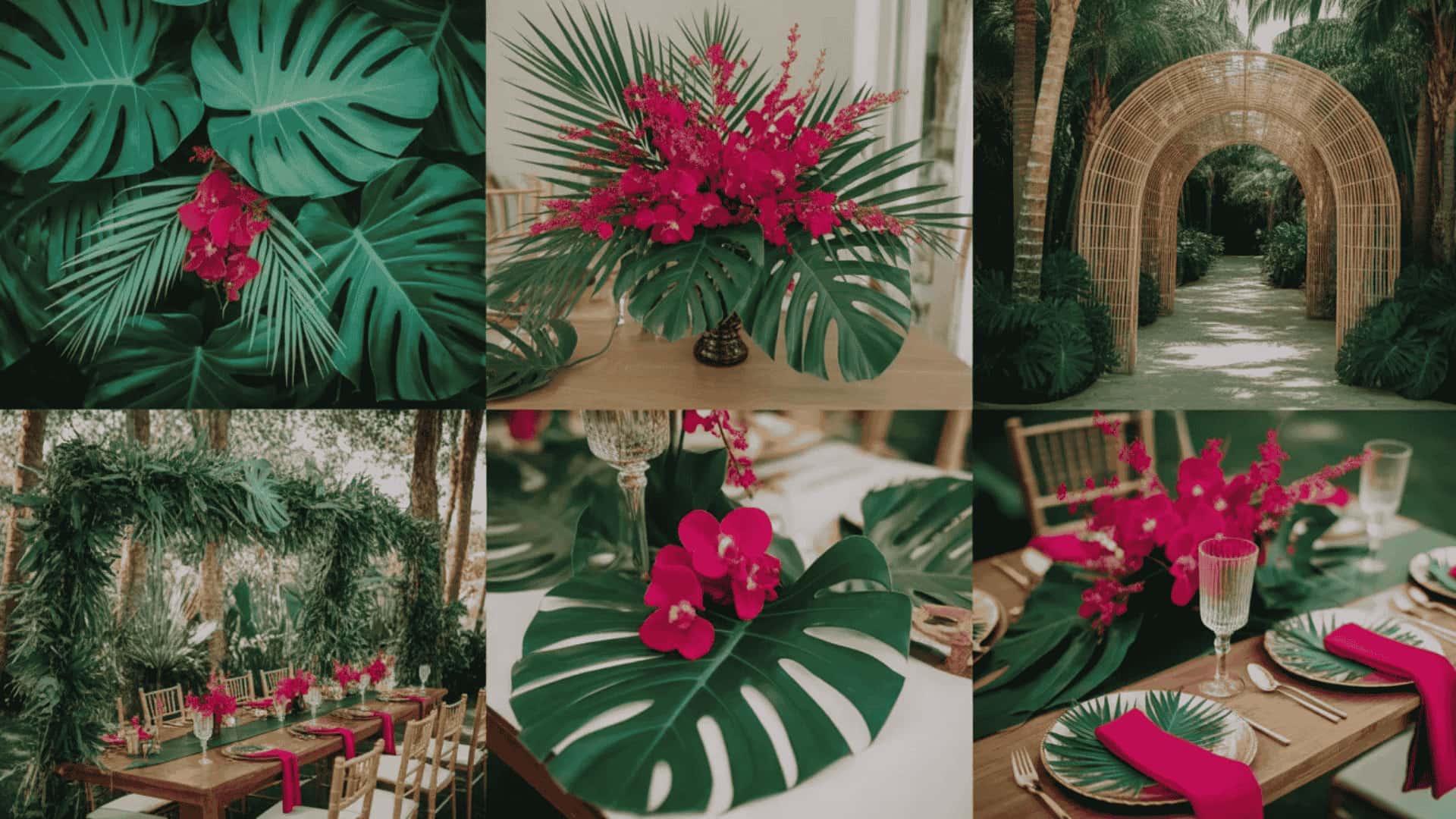
Tropical green and fuchsia are fearless, joyful, and completely unforgettable. Deep jungle greens paired with vibrant fuchsia blooms create a wedding palette that pulses with energy and personality.
This combination works beautifully for outdoor summer receptions, destination beach weddings, and couples who want their big day to feel like a genuine celebration rather than a formal affair. Large tropical leaves used as place mats add a stunning, zero-waste styling detail.
Pro Tip: Large tropical leaves as place mats look stunning and cost almost nothing.
17. Aqua and Sand Coastal Wedding Color Scheme
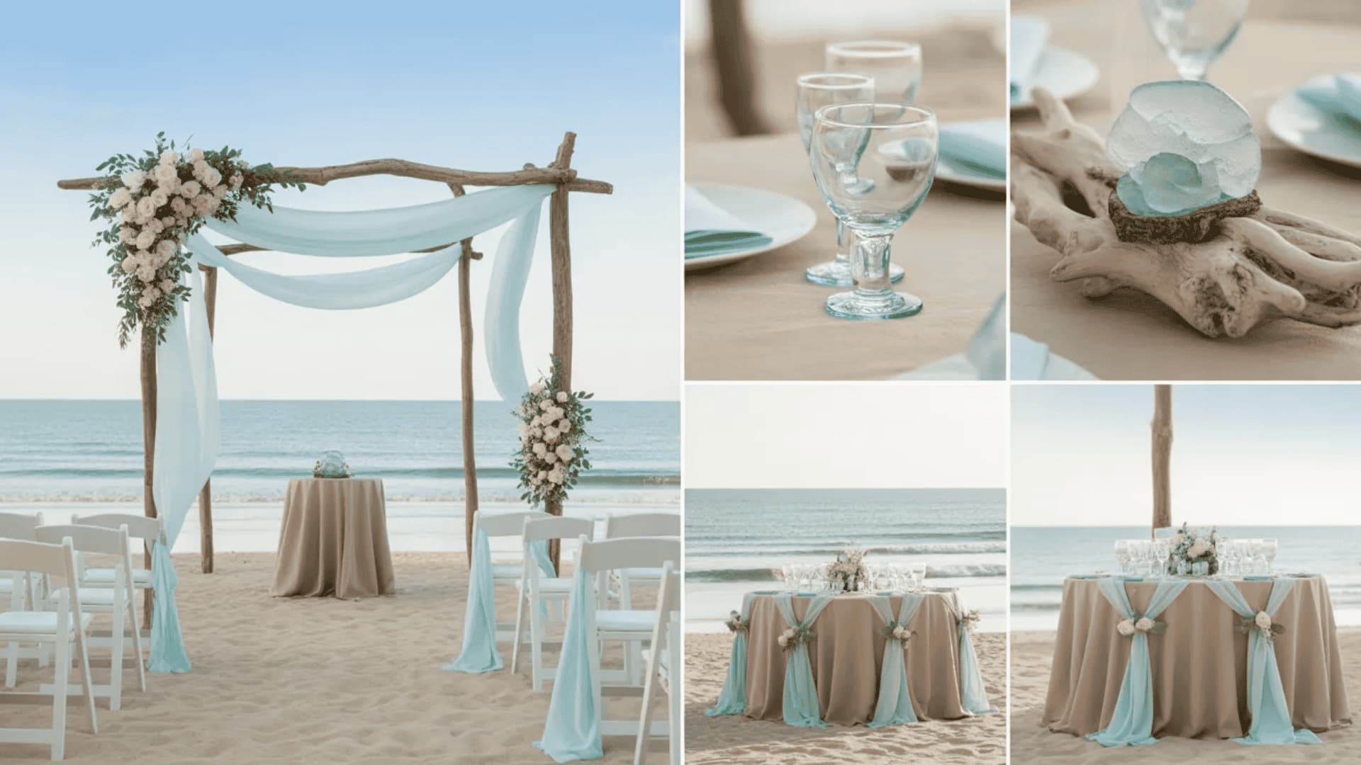
Aqua and sand are serene, breezy, and effortlessly beautiful. The cool, clear tones of aqua evoke open water and summer skies, while sandy neutrals bring warmth and grounding to the palette.
Together, they create a coastal wedding aesthetic that feels relaxed, sophisticated, and timeless. This combination suits beachside ceremonies, lakeside receptions, and outdoor garden weddings equally well, bringing a sense of calm and natural beauty to every element of the décor.
Pro Tip: Driftwood and sea glass accents reinforce the coastal palette without feeling kitschy.
Fall Wedding Color Schemes
Autumn weddings are warm, moody, and breathtakingly beautiful. These fall wedding color schemes embrace the season’s rich, harvest-inspired palette, ranging from deep jewel tones to earthy neutrals that feel like a warm embrace.
18. Burgundy and Gold Fall
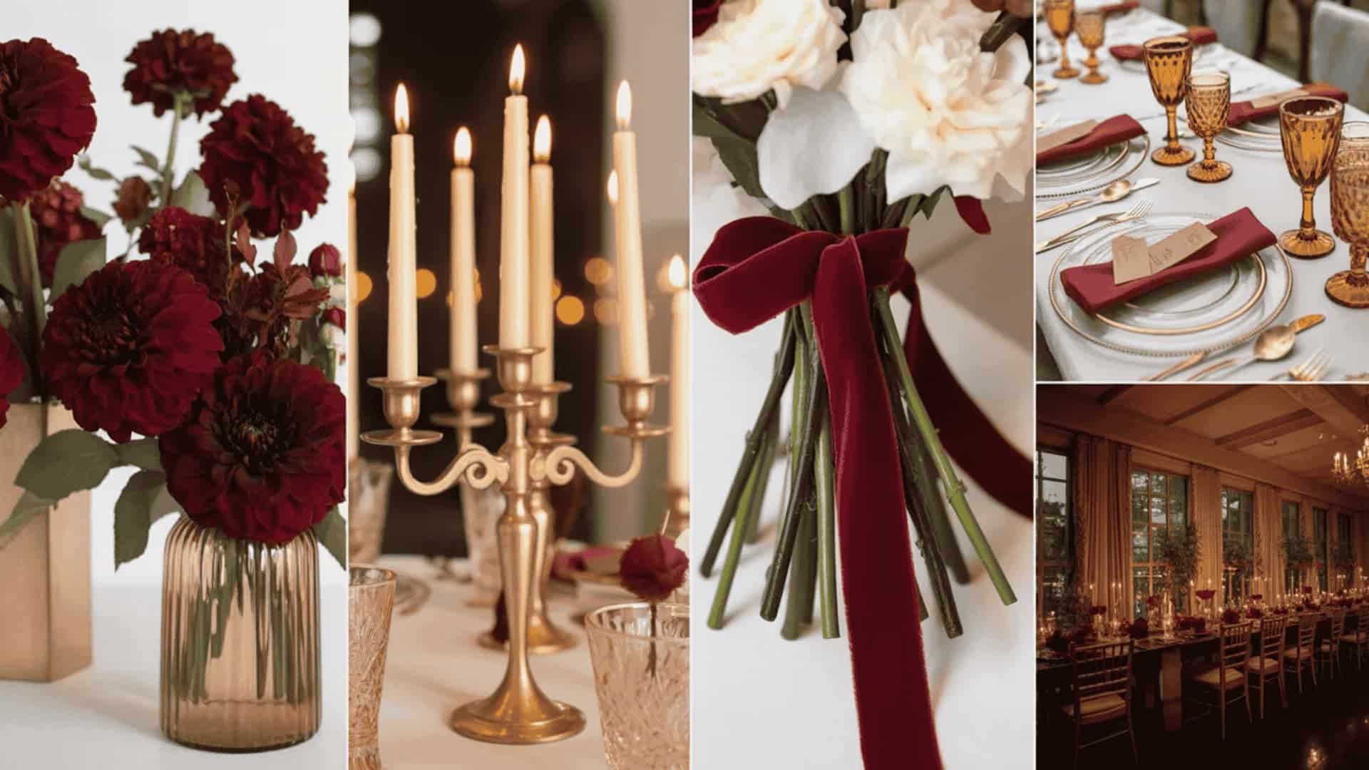
Burgundy and gold are the ultimate fall wedding palette. It’s opulent, warm, and timelessly elegant. Deep wine-toned burgundy florals against gold candelabras, amber glassware, and ivory table settings create a reception that feels genuinely luxurious.
This combination suits rustic barn weddings, vineyard ceremonies, and grand ballroom receptions equally beautifully. It is one of those rare fall wedding color ideas that feels completely at home in both intimate and large-scale wedding settings.
Pro Tip: Burgundy velvet ribbon on bouquets adds a luxurious tactile detail photographers love.
19. Burnt Orange and Deep Brown
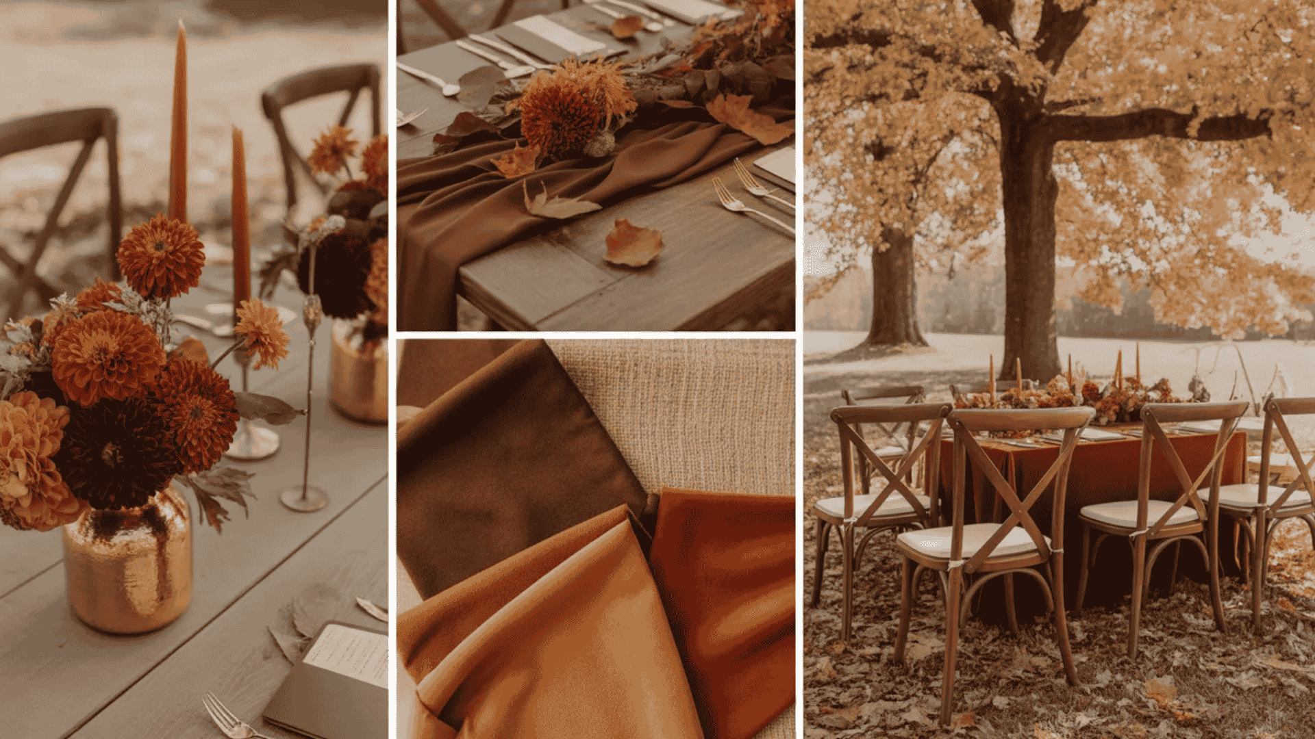
Burnt orange and deep brown are earthy, grounded, and deeply warming. This palette draws directly from autumn’s most iconic natural tones, such as fallen leaves, rich soil, and harvest light, creating a wedding style that feels completely at one with the season.
Mocha Mousse linen napkins, alongside burnt-orange centerpiece florals, tie the palette together beautifully. Groomsmen in chocolate-brown suits with burnt-orange pocket squares complete the cohesive, nature-inspired look effortlessly.
Pro Tip: Mocha Mousse linen napkins tie burnt orange florals into one cohesive story.
20. Olive Green and Marsala Wedding Palette
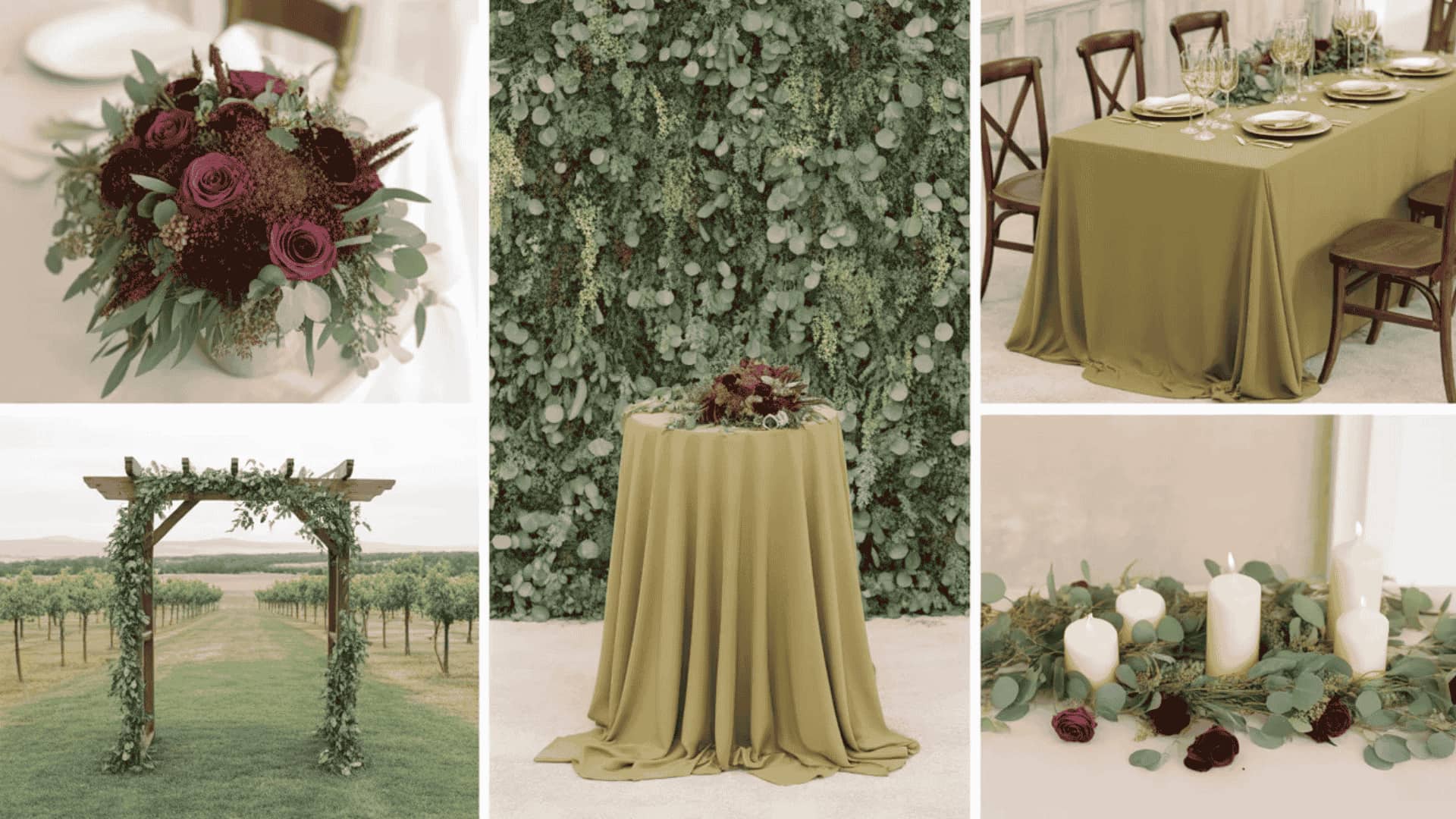
Olive green and marsala are a sophisticated, editorial fall pairing that feels both fashion-forward and deeply romantic. Marsala, a rich brick-toned red, brings intensity and warmth, while olive green grounds the palette with an organic, earthy calm.
Satin bridesmaid dresses in marsala against lush olive greenery create a striking, high-contrast bridal party aesthetic. This combination works beautifully for outdoor woodland ceremonies, rustic vineyard receptions, and intimate barn weddings.
Pro Tip: Marsala satin bridesmaid dresses against olive greenery create a stunning editorial contrast.
21. Navy and Copper Fall Wedding Color Scheme
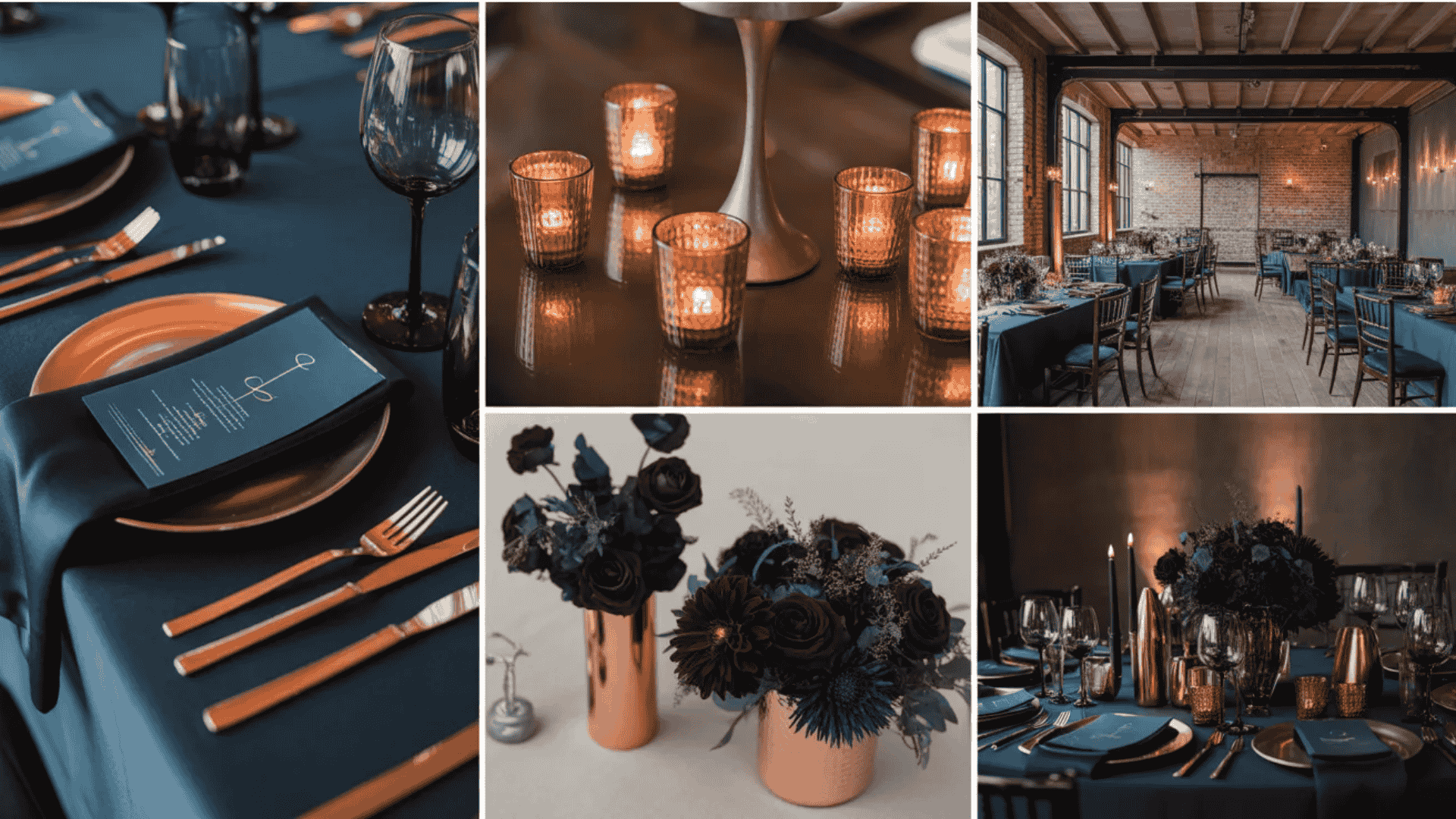
Navy and copper are bold, modern, and unexpectedly warm for a fall wedding palette. Deep navy creates a rich, dramatic backdrop while copper accents in candle holders, cutlery, and floral wire details introduce a warm metallic glow that feels perfectly autumnal.
This pairing works beautifully in industrial venues, converted warehouses, and dark-interior reception spaces where copper candlelight can truly come alive against a navy-dressed tablescape.
Pro Tip: Copper candle holders clustered in odd numbers create effortless, dramatic table styling.
22. Dusty Rose and Champagne Autumn Color Scheme
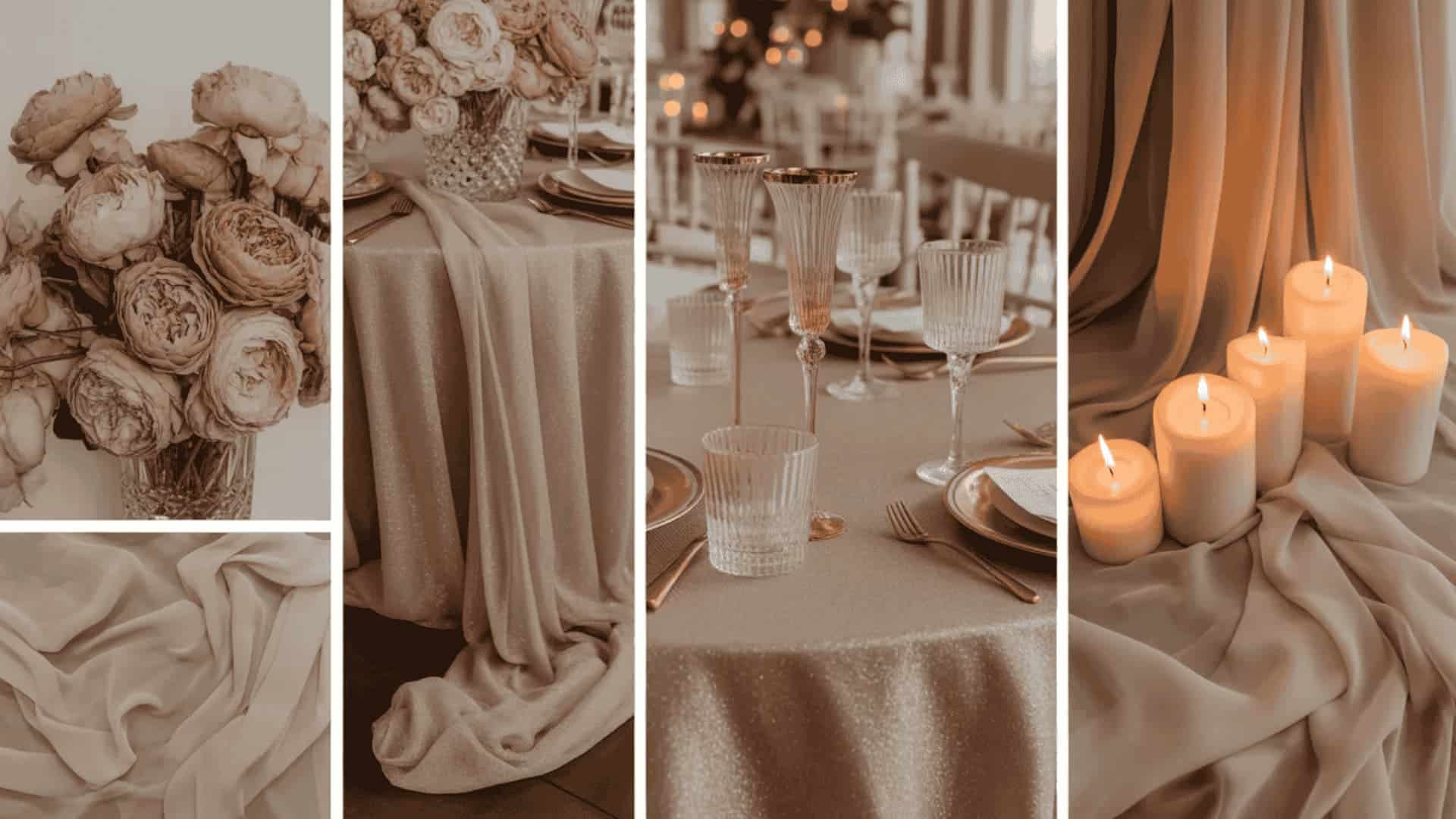
Dusty rose, and champagne is soft, romantic, and quietly luxurious, offering a gentler alternative to the bolder fall palettes. Dusty rose florals bring warmth and femininity, while champagne tones in sequin tablecloths, metallic accents, and glassware add a subtle shimmer that beautifully catches candlelight.
This palette suits elegant indoor receptions, heritage venues, and garden marquees dressed for autumn. It is one of the most flattering fall wedding color ideas for photography.
Pro Tip: Champagne sequin tablecloths under dusty rose florals catch candlelight absolutely magnificently.
23. Jewel-Toned Wedding: Deep Red, Forest Green, and Plum
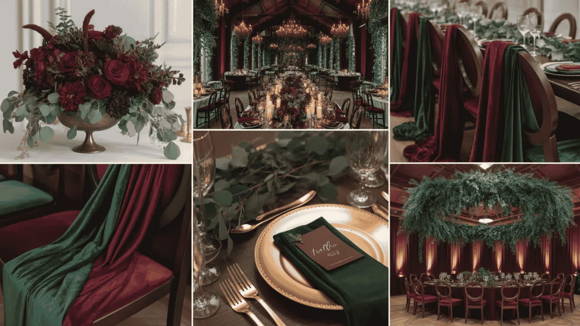
A jewel-toned fall wedding palette is dramatic, immersive, and completely show-stopping. Layering deep red, forest green, and plum together creates a rich, multidimensional color story that transforms any venue into something that feels almost theatrical.
This palette suits grand ballrooms, cathedral ceremonies, and heritage manor houses beautifully. Velvet bridesmaid dresses in rotating jewel tones, dark floral centerpieces, and ivory pillar candles complete the moody, luxurious aesthetic perfectly.
Pro Tip: Ivory pillar candles balance jewel tones and prevent tablescapes from feeling too heavy.
Winter Wedding Color Ideas
Winter weddings are magical, intimate, and endlessly atmospheric. These winter wedding color schemes capture the season’s dramatic beauty, ranging from icy ethereal tones to deep, velvety palettes that feel like pure luxury.
24. Deep Emerald Green and Gold Winter Wedding Scheme
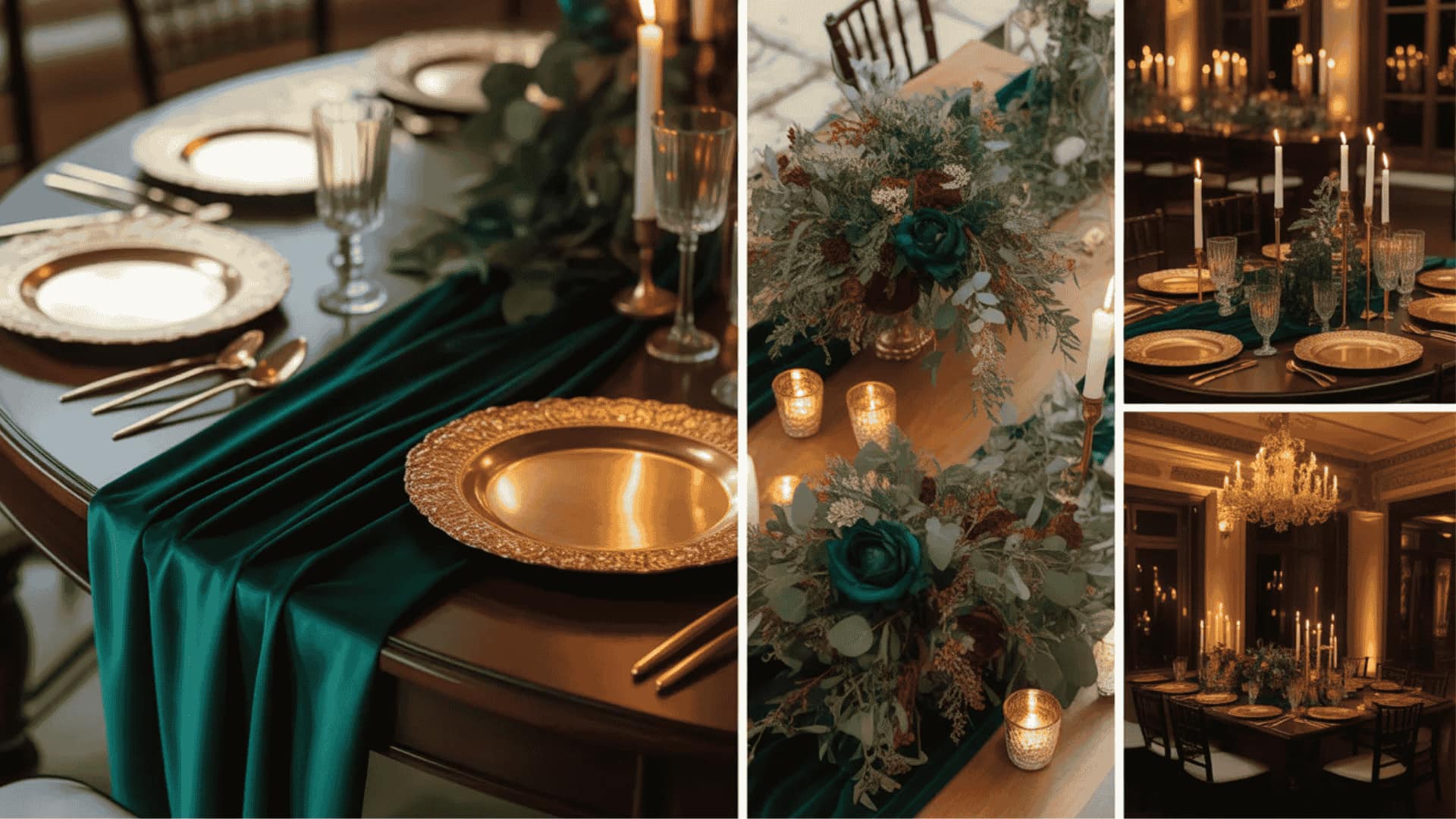
Deep emerald green and gold are the definitive winter wedding palette for couples who want their big day to feel genuinely regal. Rich emerald in velvet bridesmaid dresses, table runners, and floral arrangements creates a lush, jewel-toned backdrop that makes gold accents sing.
Gilded charger plates, gold pillar candles, and brass candlestick holders add warmth and opulence to every corner of the reception space, creating an atmosphere of effortless, timeless grandeur.
Pro Tip: Emerald velvet bridesmaid dresses are the biggest winter wedding statement of 2025.
25. Ice Blue and Silver Wedding Palette
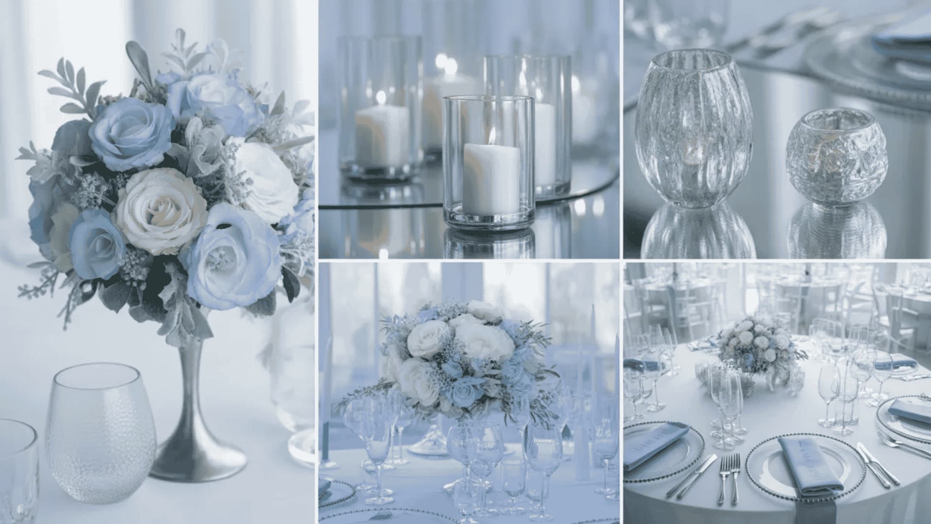
Ice blue and silver are ethereal, luminous, and utterly breathtaking for a winter wedding. Pale ice-blue florals, paired with silver metallic accents in candle holders, charger plates, and frosted stationery, create a reception that feels like stepping into a snow globe.
This palette works beautifully in white-walled venues, glass conservatories, and candlelit barns where silver reflections amplify the soft, wintry glow of every light source throughout the evening.
Pro Tip: Frosted acrylic signage with silver lettering amplifies the winter wonderland feeling perfectly.
26. Black, White, and Deep Plum
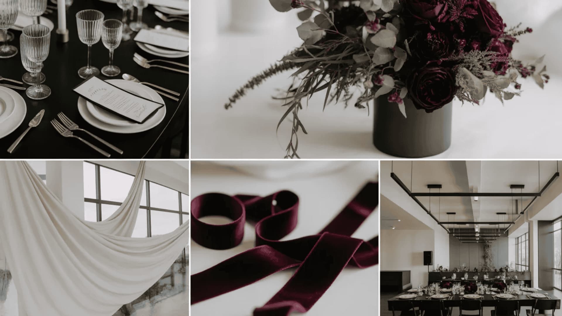
Black, white, and deep plum are sophisticated, dramatic, and deeply romantic. The timeless contrast of black and white provides a clean, elegant foundation while deep plum, introduced through florals, ribbon details, and stationery, adds a layer of mystery and richness that feels completely at home in a winter wedding setting.
This palette suits black-tie receptions, contemporary urban venues, and candlelit heritage spaces where dark, moody tones create genuine atmosphere.
Pro Tip: A deep plum wedding cake with edible gold leaf is an absolute showstopper.
27. Sapphire Blue and Pearl
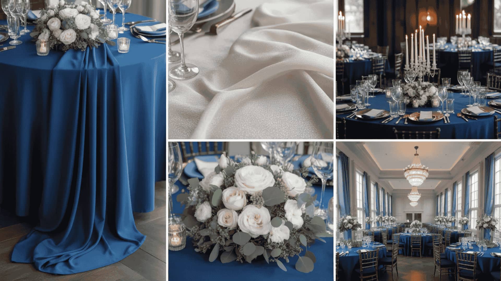
Sapphire blue and pearl are luxurious, timeless, and quietly breathtaking. Deep sapphire brings a bold, jewel-toned richness, while pearl tones in table linens, bridesmaid accessories, and floral accents add a soft, luminous warmth, preventing the palette from feeling cold or stark.
It works beautifully for formal evening receptions, black-tie winter weddings, and grand ballroom celebrations where the depth of sapphire can be fully appreciated against rich, ambient lighting.
Pro Tip: Pearl-toned tablecloths reflect candlelight like no other linen.
28. Moody Berry: Deep Purple, Plum, and Burgundy
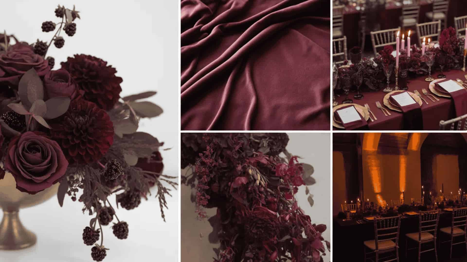
The moody berry palette is romantic, immersive, and one of the most visually striking winter wedding color ideas available. Layering deep purple, plum, and burgundy together creates a rich, dimensional color story that feels like a winter garden in full, dramatic bloom.
Velvet textures in bridesmaid dresses, dark-berry floral centerpieces, and taper candles of varying heights complete an aesthetic that is equal parts romantic and theatrical.
Pro Tip: Berry-toned taper candles in three varying heights add instant, effortless drama.
Cultural and Destination Wedding Color Ideas
Some of the most breathtaking wedding color schemes draw inspiration from culture, heritage, and place. These destinations and culturally inspired palettes bring rich meaning, tradition, and visual storytelling to your most important day.
29. Red and Gold: Indian and South Asian Wedding
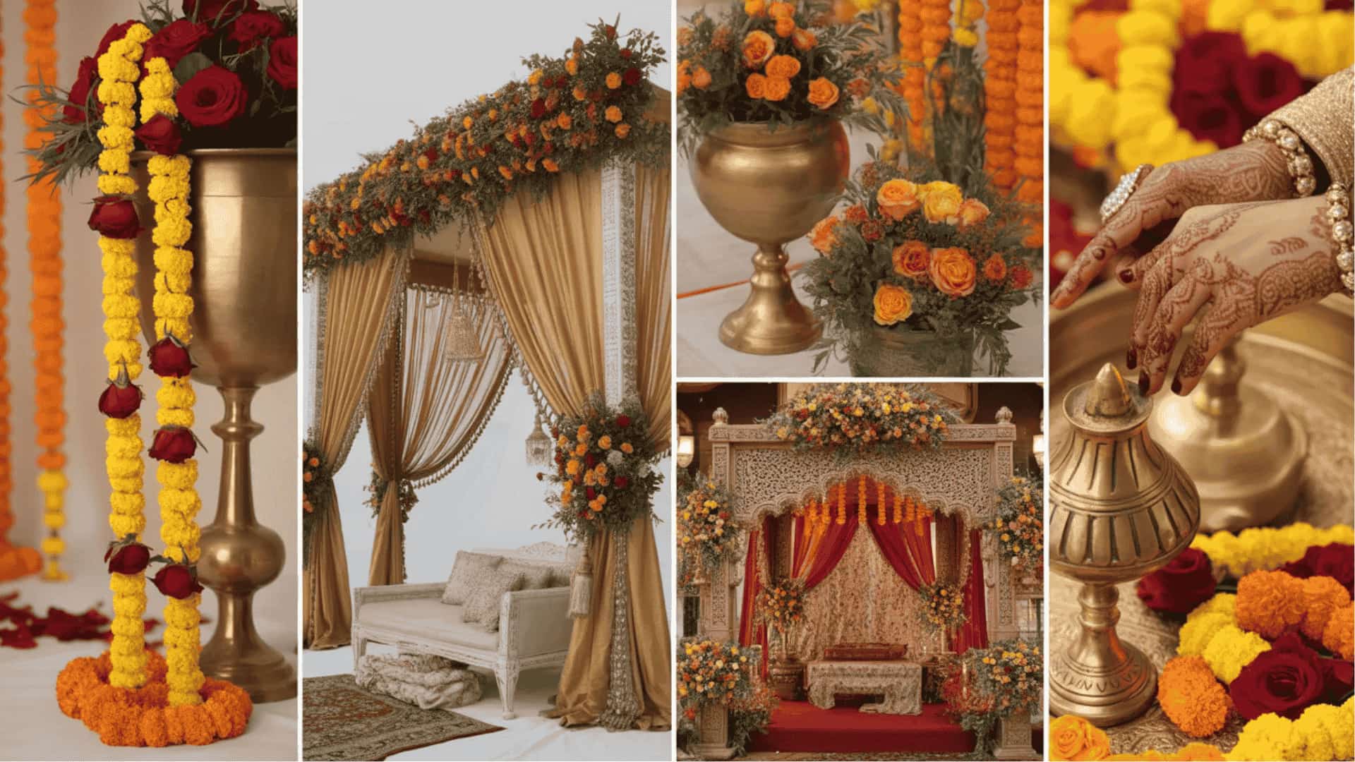
Red and gold are the most iconic, deeply meaningful wedding color combinations in South Asian wedding tradition. Red symbolizes love, prosperity, and new beginnings, while gold adds a richness and grandeur that feels celebratory from the very first glance.
Marigold garlands, red rose petal mandap decorations, and gold-embroidered fabric draping create a wedding aesthetic that is visually spectacular, culturally resonant, and endlessly photogenic. This palette works equally beautifully for mehendi, sangeet, and wedding receptions.
Pro Tip: Marigold garlands paired with red roses are the most photogenic South Asian décor combination.
30. White and Blue: Greek and Mediterranean Destination Wedding
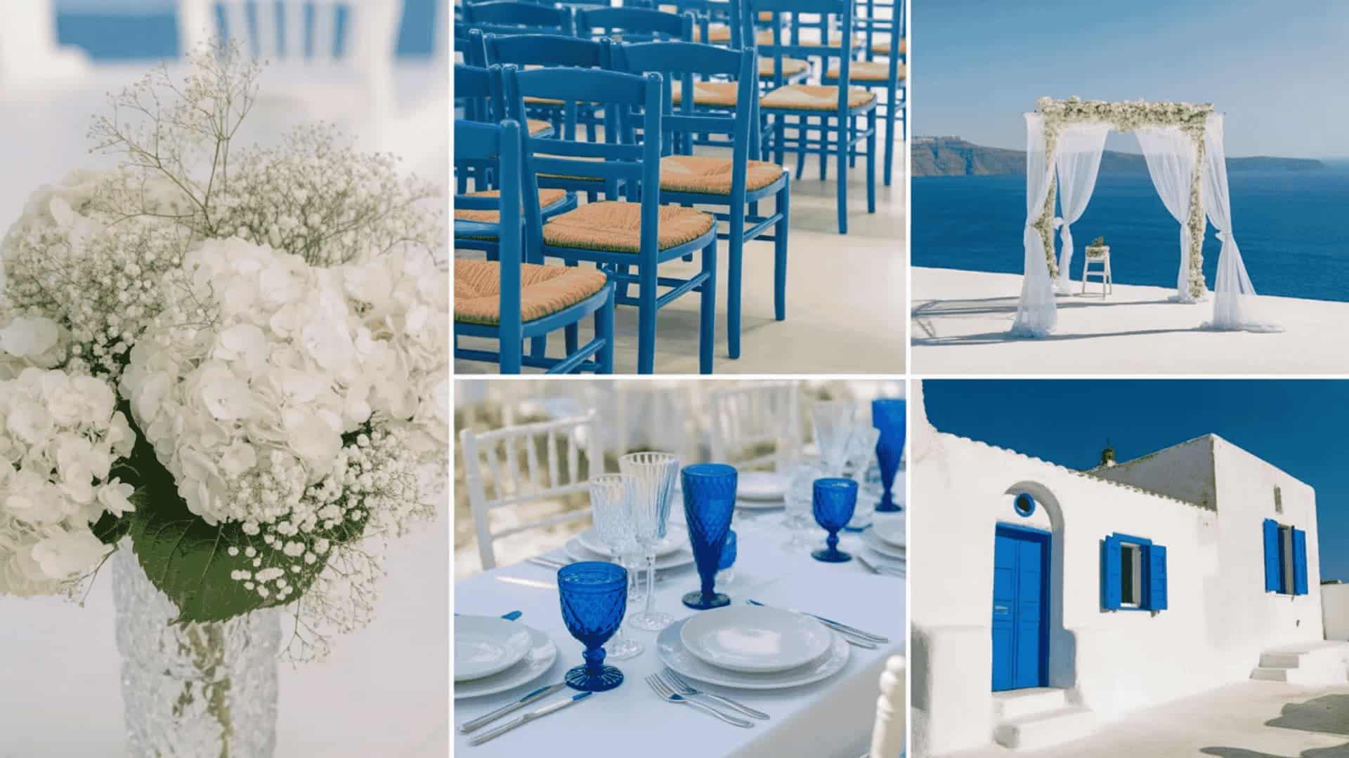
White and blue are the colors of the Mediterranean, instantly evocative of whitewashed Santorini walls, cobalt-domed churches, and sun-drenched Aegean coastlines.
This palette brings a clean, architectural simplicity to wedding décor that feels both timeless and deeply romantic. White florals, blue-painted wooden chairs, cobalt glassware, and crisp linen table settings create a destination wedding aesthetic that transports every guest to a sunlit Greek island, regardless of where the celebration actually takes place.
Pro Tip: Blue-painted wooden chairs replace costly chair covers and photograph like a professional set.
31. Dusty Sage and Terracotta: Tuscan Countryside Wedding
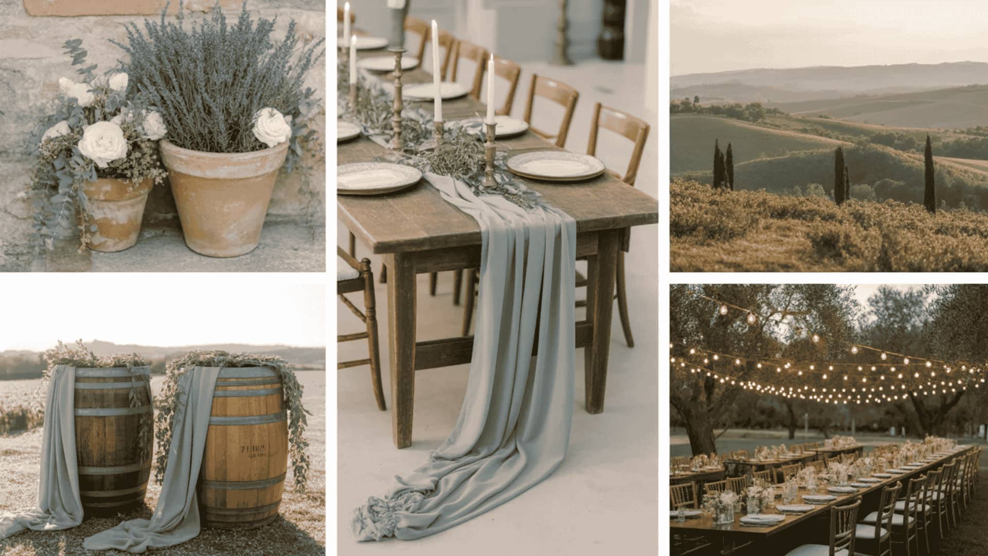
Dusty sage and terracotta are the color story of the Italian countryside: warm, organic, and deeply romantic. Sun-baked terracotta tones evoke crumbling villa walls and harvest fields while dusty sage brings a cool, silvery calm that perfectly balances the warmth.
Linen fabric in dusty sage, draped over wine barrels; terracotta pot centerpieces filled with wildflowers; and hand-lettered wooden signage create an authentic Tuscan atmosphere that feels genuinely transportive, intimate, and utterly unforgettable for every guest.
Pro Tip: Dusty sage linen draped over wine barrels creates an authentic Tuscan atmosphere wherever you are.
Trendy and Modern Wedding Color Schemes for 2025 and 2026
These are the wedding color ideas setting the tone right now. Fresh, fashion-forward, and deeply influenced by global design trends, these modern palettes feel current, confident, and completely irresistible.
29. Mocha Mousse and Cream Wedding Color Scheme
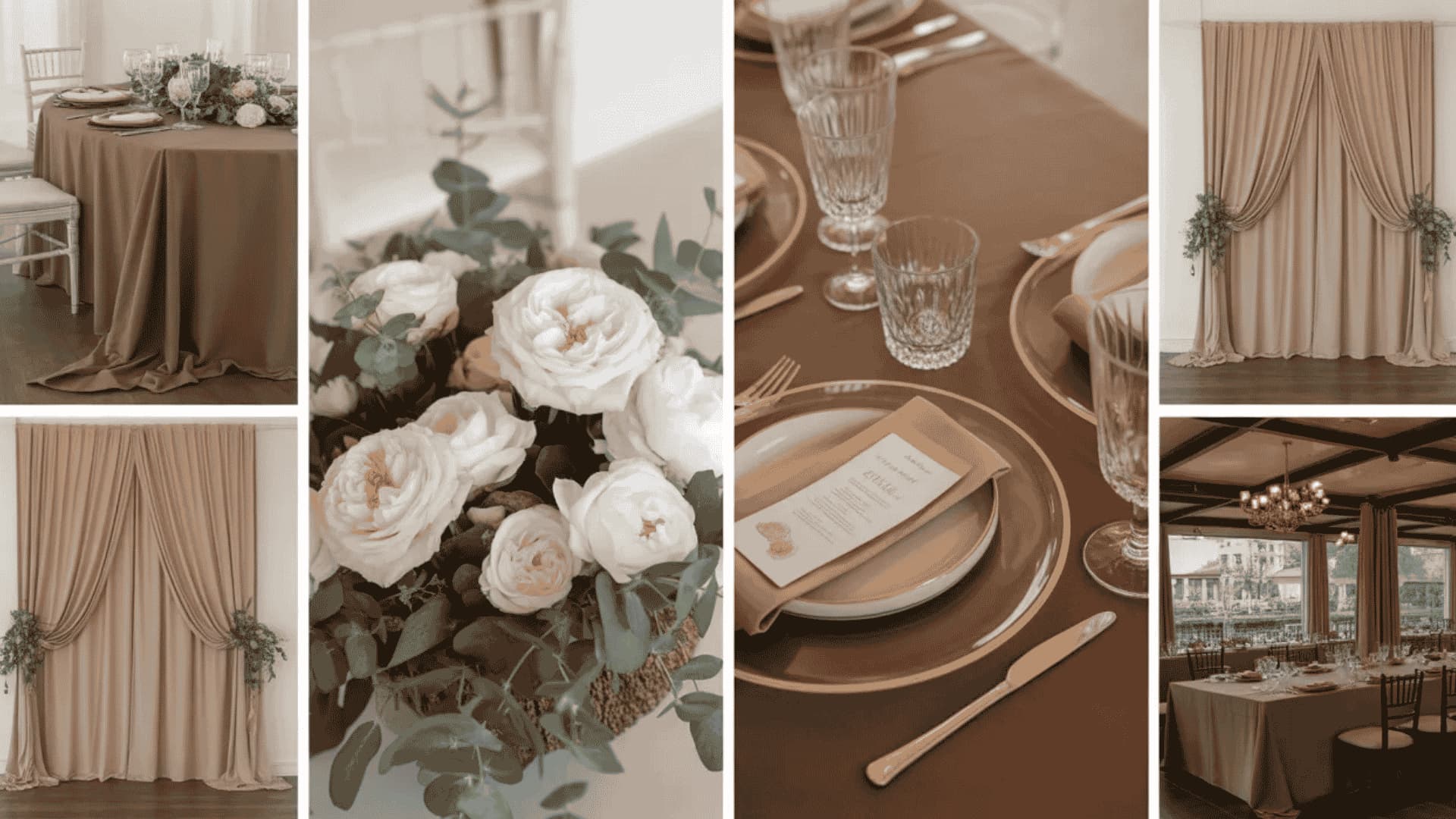
Mocha Mousse, Pantone’s official Color of the Year for 2025, is warm, sophisticated, and endlessly versatile. Paired with cream, this palette creates a wedding aesthetic that feels deeply luxurious without relying on metallics or bold contrasts.
Mocha linen tablecloths, cream florals, and warm-toned candles layer together beautifully to create a reception that feels effortlessly refined. This is the palette for couples who want their wedding to feel timeless, grown-up, and genuinely elegant.
Pro Tip: Mocha linen paired with cream florals is the most effortlessly chic neutral combination.
30. Pistachio Green and Soft White Modern Wedding Scheme
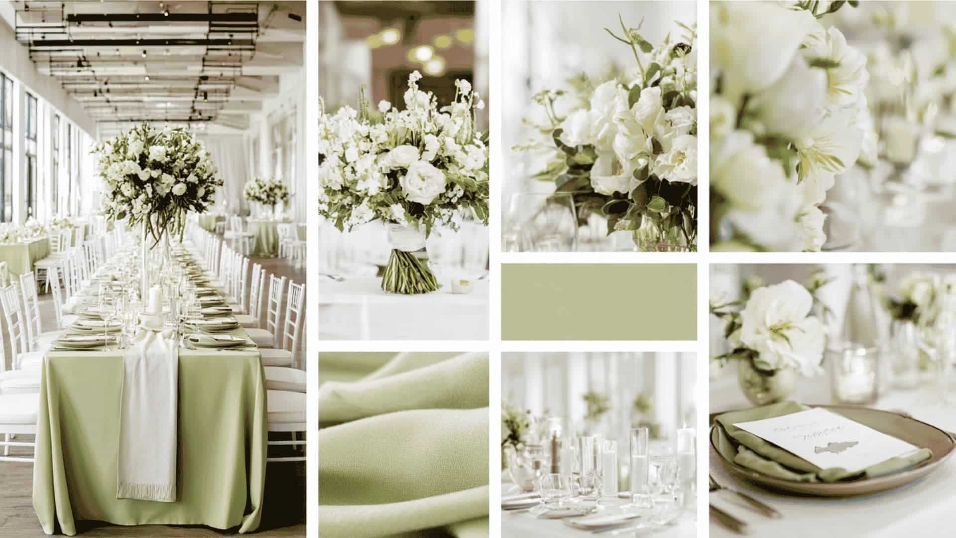
Pistachio green is the freshest, most unexpected color story emerging in weddings in 2025 and 2026. Soft and muted yet undeniably vibrant, pistachio brings a playful, nature-inspired energy that pairs beautifully with clean, soft white.
Pistachio bridesmaid dresses in mixed fabrics such as satin, chiffon, and velvet create a dimensional, editorial bridal party look. White florals with pistachio ribbon details and white linen tablecloths keep the overall palette feeling crisp, modern, and effortlessly stylish.
Pro Tip: Pistachio bridesmaid dresses in mixed fabrics like satin, chiffon, and velvet add beautiful dimension.
31. Pink and Brown Romantic Wedding Color Palette
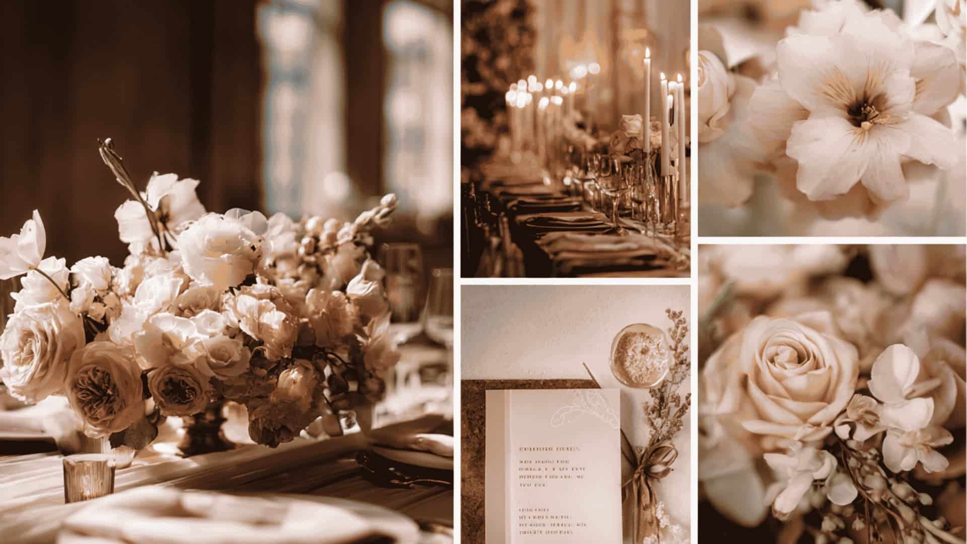
Pink and brown is the unexpected color pairing that has taken the 2025 and 2026 wedding world completely by storm. Warm chocolate brown grounds the palette with richness and depth, while soft pink, used in florals, ribbons, and stationery details, adds romance and femininity.
This combination works beautifully across rustic barn weddings, contemporary urban receptions, and intimate garden ceremonies. It is warm, modern, and genuinely unlike anything couples were doing just a few years ago.
Pro Tip: Chocolate-brown stationery with pink wax seals is an affordable luxury that guests notice.
32. Forest Green and Beige Wedding Color Scheme
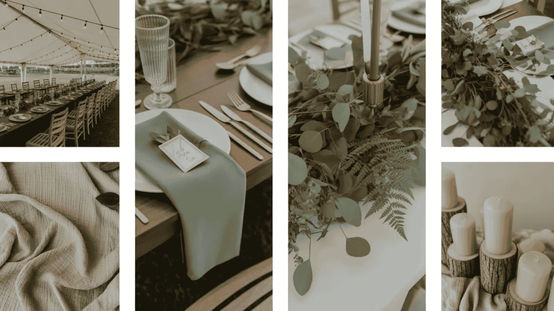
Forest green and beige are rapidly emerging as the sophisticated new alternative to the classic black and white wedding palette.
Deep, rich forest green provides dramatic depth and grounding, while warm beige, featured in linen, bridesmaid dresses, and floral accents, softens the combination into something that feels organic and effortlessly elegant.
Leading wedding designers are calling this the “new black and white” for 2026, and it is easy to see why, as it works in every venue, every season, and every style.
Pro Tip: Forest green groom suits with beige pocket squares are fashion-forward yet completely timeless.
Common Mistakes to Avoid While Selecting a Color Scheme
Even the most beautiful wedding color ideas can go wrong. Avoid these five common mistakes and keep your palette looking intentional, cohesive, and stunning throughout your entire big day.
- Choosing Too Many Colors at Once. More than three to four colors create visual chaos. Stick to a maximum of one dominant, one secondary, and one accent color.
- Ignoring Your Venue’s Existing Colors: Stone walls, patterned carpets, and colored ceilings clash horribly with the wrong palette. Always visit your venue before finalizing any color decisions.
- Picking Colors That Do Not Photograph Well: Neon shades and very pale pastels lose vibrancy in photos. Always test your palette under your venue’s actual lighting conditions before committing.
- Following Trends Without Considering Your Personal Style: Trendy palettes look stunning on Pinterest, but can feel wrong in person. Choose colors that genuinely reflect your personality and love story.
- Forgetting to Test Swatches in Real Life: Colors look completely different on screen versus on fabric, florals, and prints. Always test physical swatches together in your venue before making final decisions.
Avoiding these common pitfalls ensures your wedding palette feels intentional, polished, and truly yours. Trust your instincts, test everything in person, and choose colors that beautifully tell your unique love story.
Wrap Up
Your wedding color scheme is more than a design choice; it is the emotional fingerprint of your entire celebration.
From timeless classics like white and gold to modern favorites like Mocha Mousse and pistachio green, the right palette weaves every floral, fabric, and photograph into one unforgettable story.
Lean into seasonal inspiration, cultural roots, or fresh 2026 trends, but remember the real secret is choosing colors that genuinely feel like you, not just what looks beautiful on a mood board.
Test your swatches, trust your instincts, and let your palette tell a story only the two of you can tell.
So, which palette spoke to your heart? Save this, share it with your partner, and drop a comment with the color combination you cannot stop thinking about.
Frequently Asked Questions
How Many Colors Should I Choose for My Wedding Palette?
Stick to three or four colors maximum: one dominant, one secondary, and one or two accent shades for balance.
When Should I Finalize My Wedding Color Scheme?
Finalize your palette nine to twelve months before the wedding, ideally after booking your venue but before ordering stationery.
Which Wedding Color Schemes Photograph Best?
Soft neutrals, blush, dusty blue, emerald, and burgundy photograph beautifully. Avoid neon brights and very pale pastels, as they lose vibrancy.