
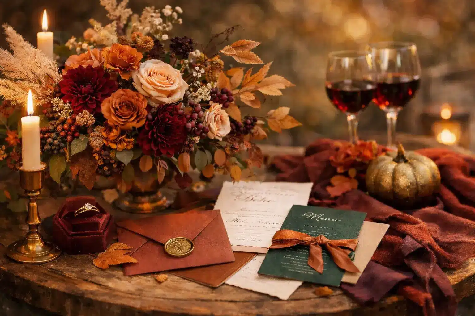
I’ve sat through enough fall wedding planning conversations to know the moment someone says “autumn palette,” half the room pictures burnt orange and burlap. And look, I get it. But autumn wedding colors run so much deeper than that.
This season offers some of the most romantic, unexpected color stories of the year, yet most never make it onto a mood board because people don’t know where to look.
After years of planning, note-taking, and more rom-com research than I’d like to admit, I put together autumn wedding palette ideas organized by vibe, not just season.
So you can look at a fall wedding color scheme and actually say, yes, that one feels like us.
Quick PicksFall isn’t just burnt orange, deep plum, dusty rose, and warm copper all belong to this season too. Most of the autumn palettes pair one rich anchor color with a soft neutral, not three bold shades fighting for attention. Organizing your fall wedding colors by mood, romantic, earthy, and dramatic, makes it easier to choose what actually feels like you. |
How to Choose a Perfect Fall Wedding Color Palette
Most palette regrets come from picking colors you love individually without considering how they actually look together.
- Start With A Base Mood: Are you drawn to something romantic and soft? Earthy and grounded? Dark and dramatic? Or clean and modern? Your mood anchors every decision after it.
- Stick to Three to Five Colors: More than that, and things start competing. Fewer than three, and it can feel flat. The sweet spot is one main color, one or two accent shades, and a neutral to hold it all together.
- Think in Layers: Your main color does the heavy lifting, bridesmaid dresses, florals, and the biggest visual moments. Your neutral lives in linens, stationery, and negative space.
- Know Where It Shows Up: A palette isn’t just about flowers. It runs through your invitations, table settings, cake, ribbon details, candles, and attire. The more consistently it repeats, the more pulled-together everything looks on the day.
- Run the Light Test: This is the step most couples skip. Before you commit to a palette, look at your chosen colors in three conditions: natural daylight, candlelight, and the evening light at your venue. Colors behave differently in each.
Get those five things right, and the rest of the decisions get easier. You stop second-guessing every flower choice and start seeing how everything connects.
The palettes below are organized by mood, so instead of scrolling through hundreds of options, you can go straight to the section that already sounds like your wedding.
Classic Fall Wedding Palettes
These are the color combinations that have lasted for good reason. They photograph well in any light, work across every venue type, and still feel personal when styled with intention.
1. The Vineyard Standard
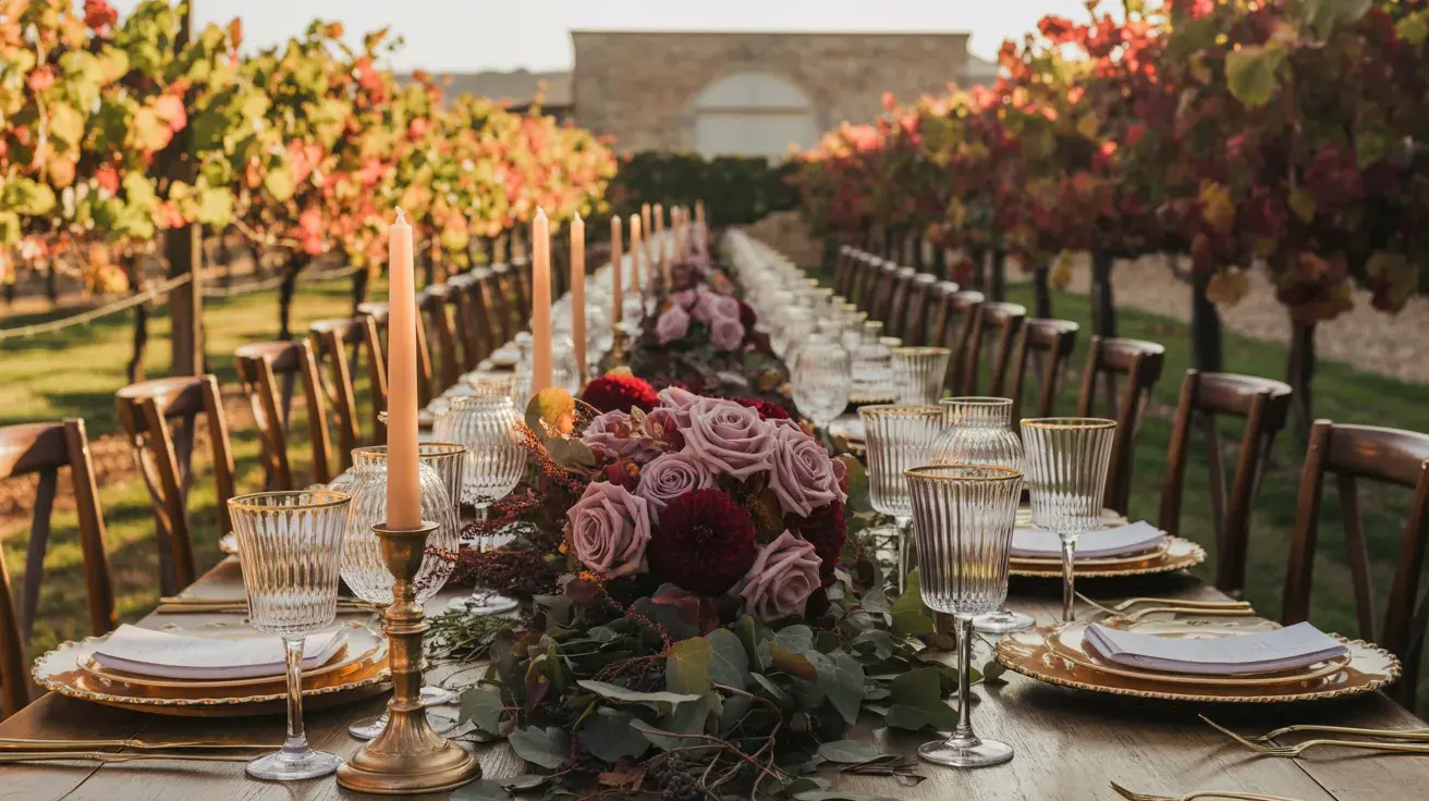
Burgundy + Gold + Forest Green Rich, warm, and completely at home in autumn. Burgundy does the work; gold catches the light; forest green keeps it from feeling heavy.
Styling tip: Use gold only in metallics, candleholders, flatware, ribbon, not in fabric. Fabric gold reads cheap fast.
2. The Estate Wedding
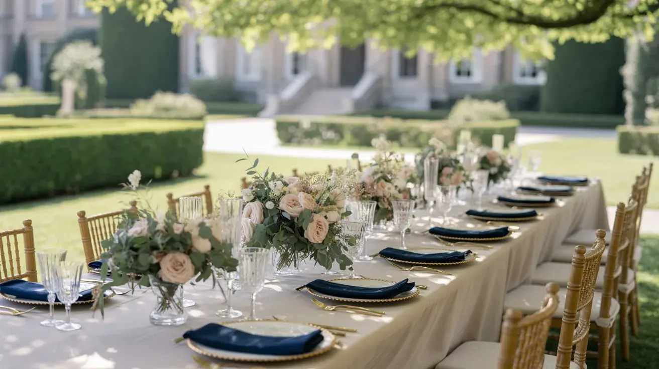
Navy + Sage + Cream Quiet and considered. This palette has a stillness to it that photographs beautifully in natural light, especially outdoors.
Styling tip: Sage works best in bridesmaid dresses when it leans gray-green rather than bright green. Pull fabric swatches in daylight before ordering.
3. Harvest Without the Hay Bales
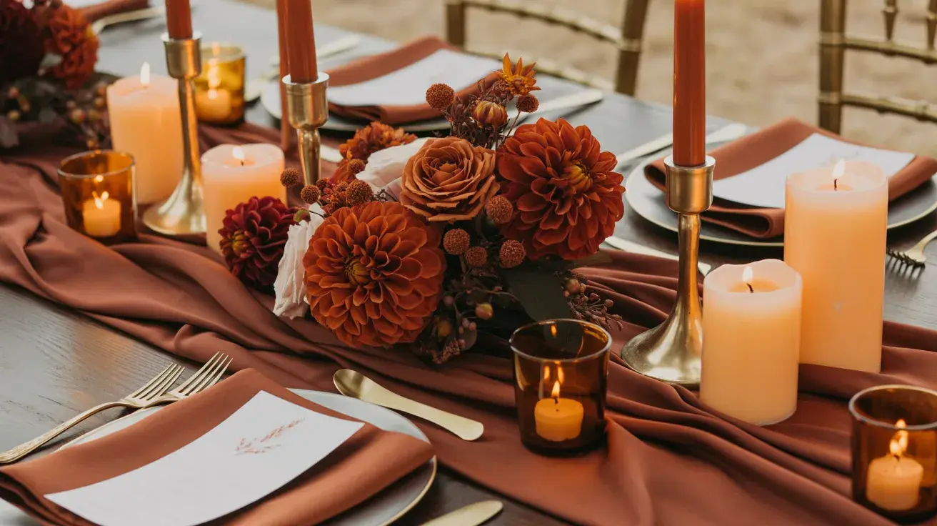
Burnt Orange + Ivory + Brown. The classic autumn trio, but the keyword here is burnt. Not pumpkin. Not neon. The kind of orange that looks like the last hour of sunlight.
Styling tip: Anchor burnt orange with chocolate brown linen rather than white. The contrast is warmer and far less stark in photos.
4. The Quiet Ballroom
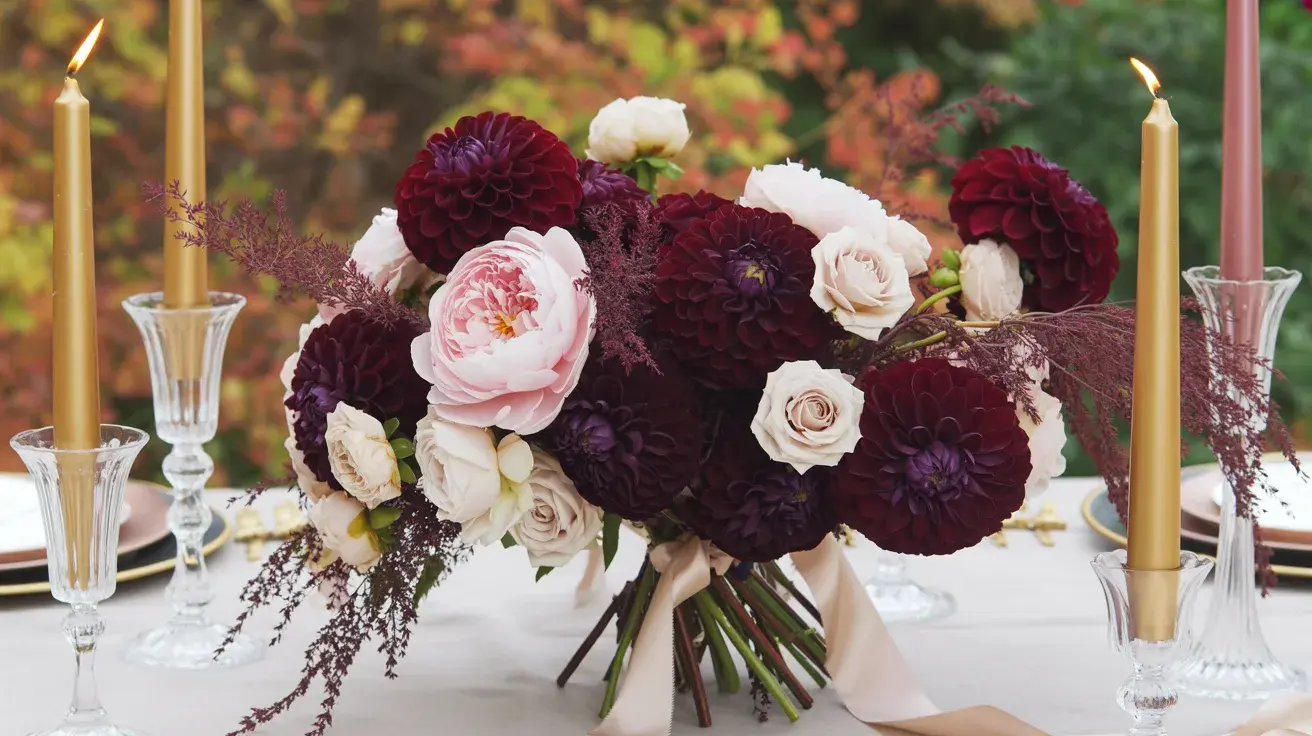
Plum + Champagne + Blush Soft enough to feel romantic, deep enough to feel grown-up. Plum keeps blush from looking too springlike; champagne ties them together without competing.
Styling tip: Use plum in florals rather than fabric; it’s harder to match across different materials and tends to look more expensive in blooms than in satin.
5. Last Light in the Garden
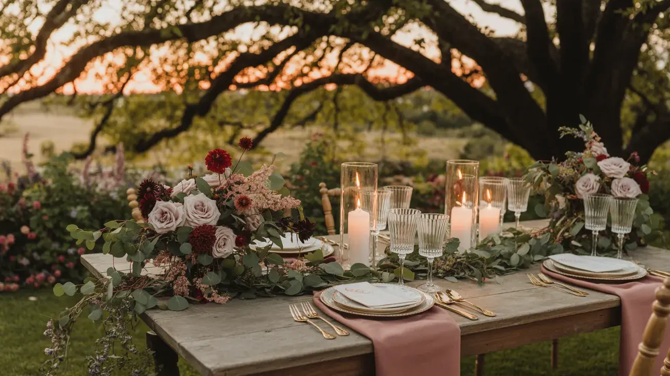
Wine Red + Dusty Rose + Greenery. This one lives in the space between summer and autumn perfectly. The dusty rose softens wine red into something less expected and more layered.
Styling tip: Mix fresh and dried florals here. Dried roses and pampas alongside fresh greenery give the palette texture that a single floral type can’t.
6. The Warm Neutral
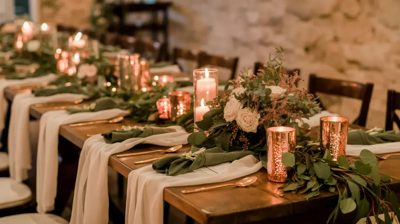
Copper + Cream + Olive Understated and warm. This palette works especially well in candlelit venues where copper picks up every flicker.
Styling tip: Copper in vessels and hardware (vases, candleholders, charger rims) photographs far better than copper in fabric, which tends to read orange under artificial light.
7. The Sunday Market
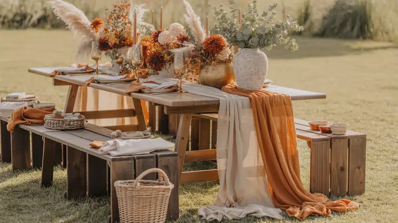
Rust + Beige + Gold Grounded, warm, and very wearable across skin tones. Rust is the kind of color that looks better in person than on screen, which makes it a great surprise on the day.
Styling tip: Keep the gold matte rather than shiny here, and use antique brass tones rather than high-polish gold. It keeps the palette from looking formal when the vibe is relaxed.
Earthy and Organic Fall Palettes
For the couple who wants their wedding to feel like it grew out of the ground rather than out of a catalog. These palettes lean natural, soft, and grounded, the kind that look just as good in an unedited photo as a styled one.
8. The Slow Morning
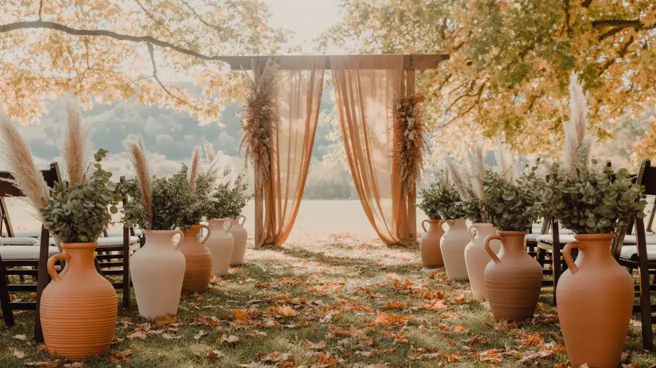
Terracotta + Sand + Olive Sun-baked and unhurried. This palette belongs at outdoor ceremonies where the surroundings do most of the visual work.
Styling tip: Terracotta in clay pots and ceramic vessels looks far more intentional than terracotta in fabric. Use it in the hard goods and let sand and olive carry the soft elements.
9. The Understated One
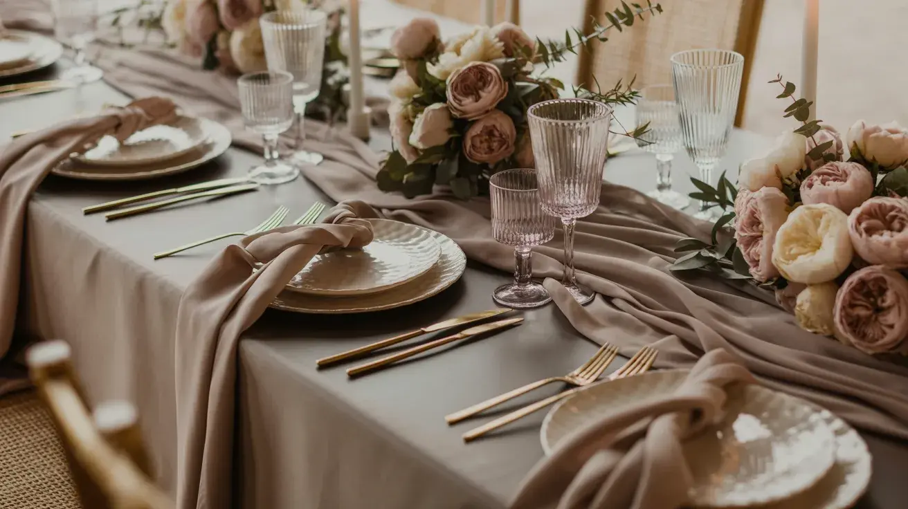
Taupe + Cream + Dusty Rose. The quietest palette on this list, and one of the hardest to pull off badly. Everything here whispers, which means your floral shapes and textures do the talking.
Styling tip: This palette needs strong floral architecture to avoid looking washed out. Sculptural blooms, dried lunaria, long-stemmed garden roses, and trailing greenery add the dimension that color isn’t providing.
10. Forest Floor
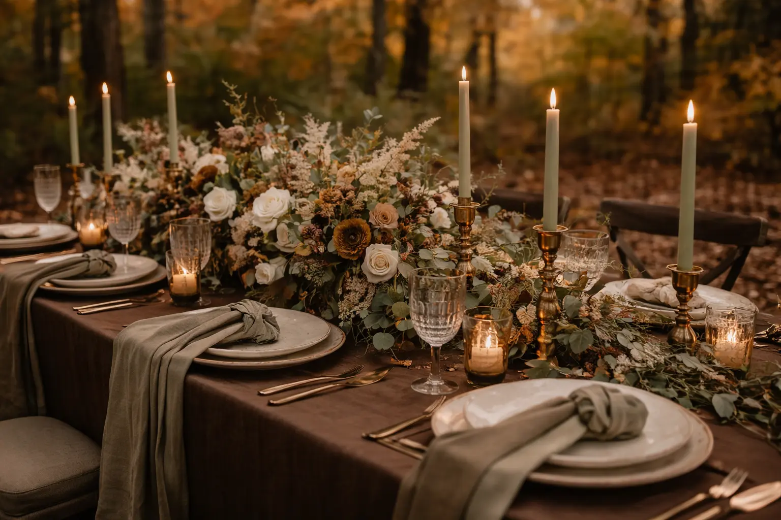
Chocolate Brown + Sage + Beige Deeply grounded and completely unexpected on a wedding tablescape. Chocolate brown is underused in weddings, and it shouldn’t be; it photographs beautifully against fall foliage.
Styling tip: Use chocolate brown in linens and dried botanicals, not in fresh florals. Brown flowers tend to look wilted; brown fabric looks intentional.
11. The Studio Pottery Wedding
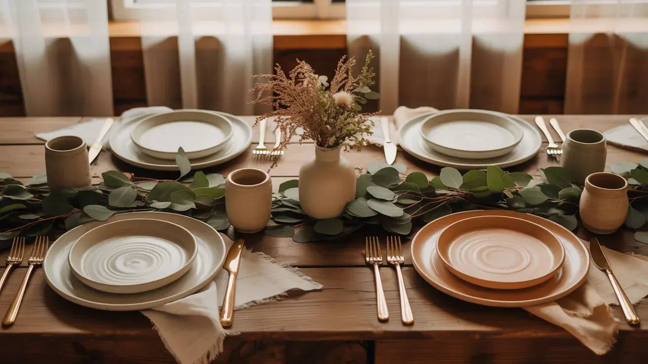
Clay + Warm White + Eucalyptus Cool-toned warm, if that makes sense. The kind of palette that makes you think of handthrown ceramics and wooden tables and morning light through linen curtains.
Styling tip: Warm white here means off-white, ecru, or parchment. Bright white next to clay looks like an accident. Pull your paper goods and linen samples side by side before committing.
12. Golden Afternoon

Caramel + Ivory + Green Warm without being heavy. Caramel reads differently depending on your lighting. In golden hour, it turns almost amber; in shade, it softens to a pale tan. Both are beautiful.
Styling tip: Use multiple shades of green rather than a single tone. Eucalyptus, fern, and dark ivy together read richer and more organic than a single green type repeated.
13. The Slow Living Wedding
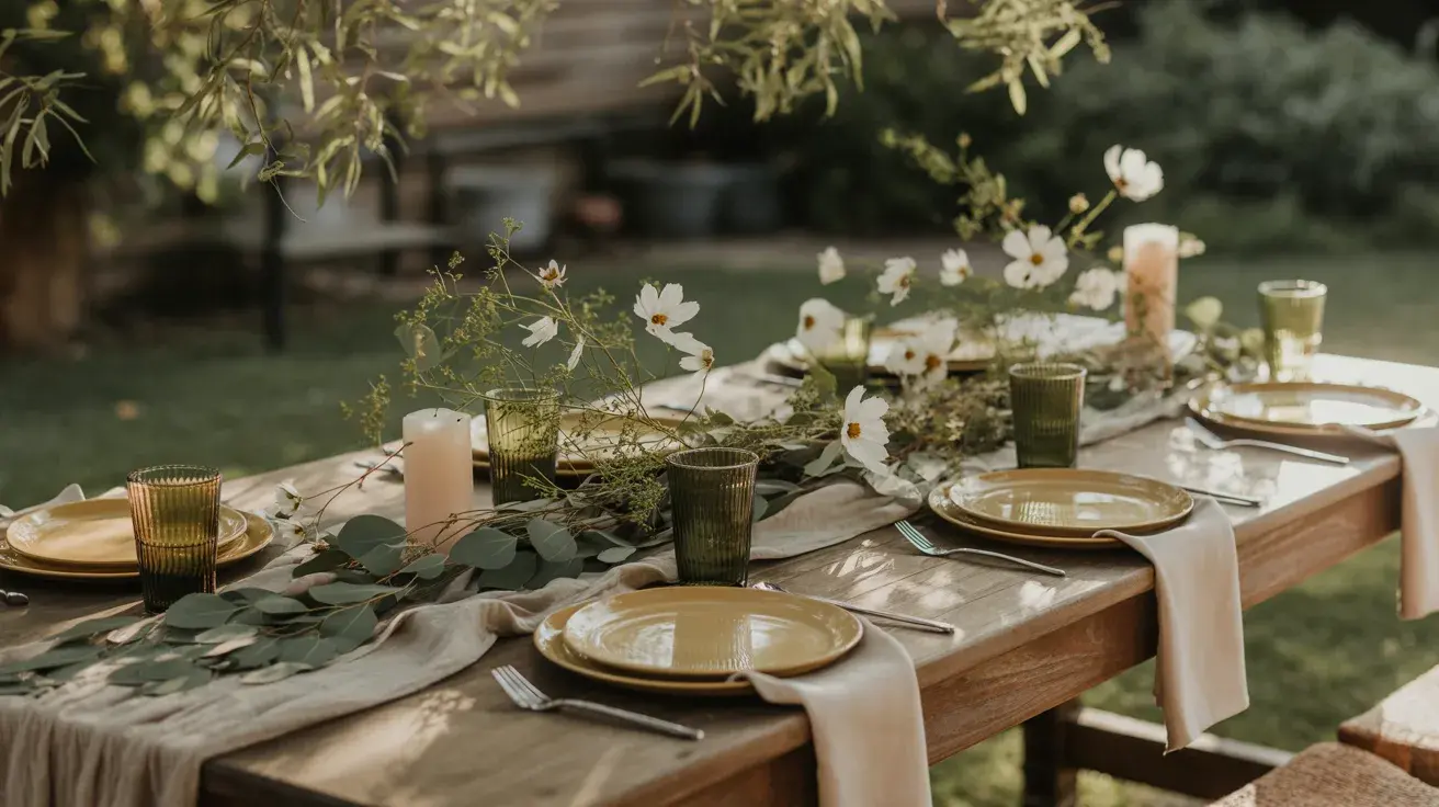
Mustard + Olive + Neutral Linen Earthy in the best way. This is the palette for the couple who would rather have a long lunch in someone’s backyard than a formal reception.
Styling tip: Mustard works best in small hits, ribbon, candles, and napkins. As a dominant color, it can read too casual. Let olive and linen carry the weight.
14. The Gray Area
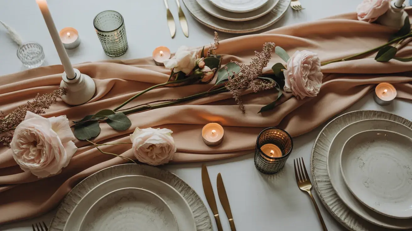
Warm Gray + Blush + Soft Green. Most gray palettes feel cold. Warm gray changes that, it sits closer to greige than silver and pairs beautifully with soft botanicals.
Styling tip: The difference between a warm gray and a cool gray is everything here. Hold your fabric swatches against your florals in the actual venue light before finalizing.
Moody and Dramatic Fall Palettes
For the evening weddings, the candlelit receptions, and the couples who looked at a soft blush palette and felt absolutely nothing. These are the color stories that photograph like a painting.
15. Midnight Garden
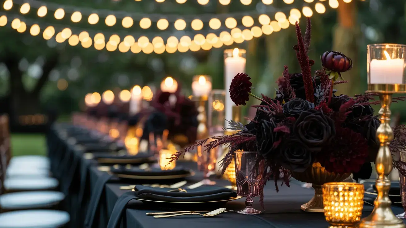
Black + Plum + Gold. This palette does not apologize for itself. Black grounds everything; plum adds color without brightness; gold makes it feel like a celebration rather than a funeral. Thus making it a perfect choice for those seeking ideas for an outdoor wedding setup.
Styling tip: Keep black in hard surfaces, chargers, menus, signage frames, and let plum live in the florals. Black fabric in bridesmaid dresses can look flat in photos; black details read intentional.
16. The Collector’s Study
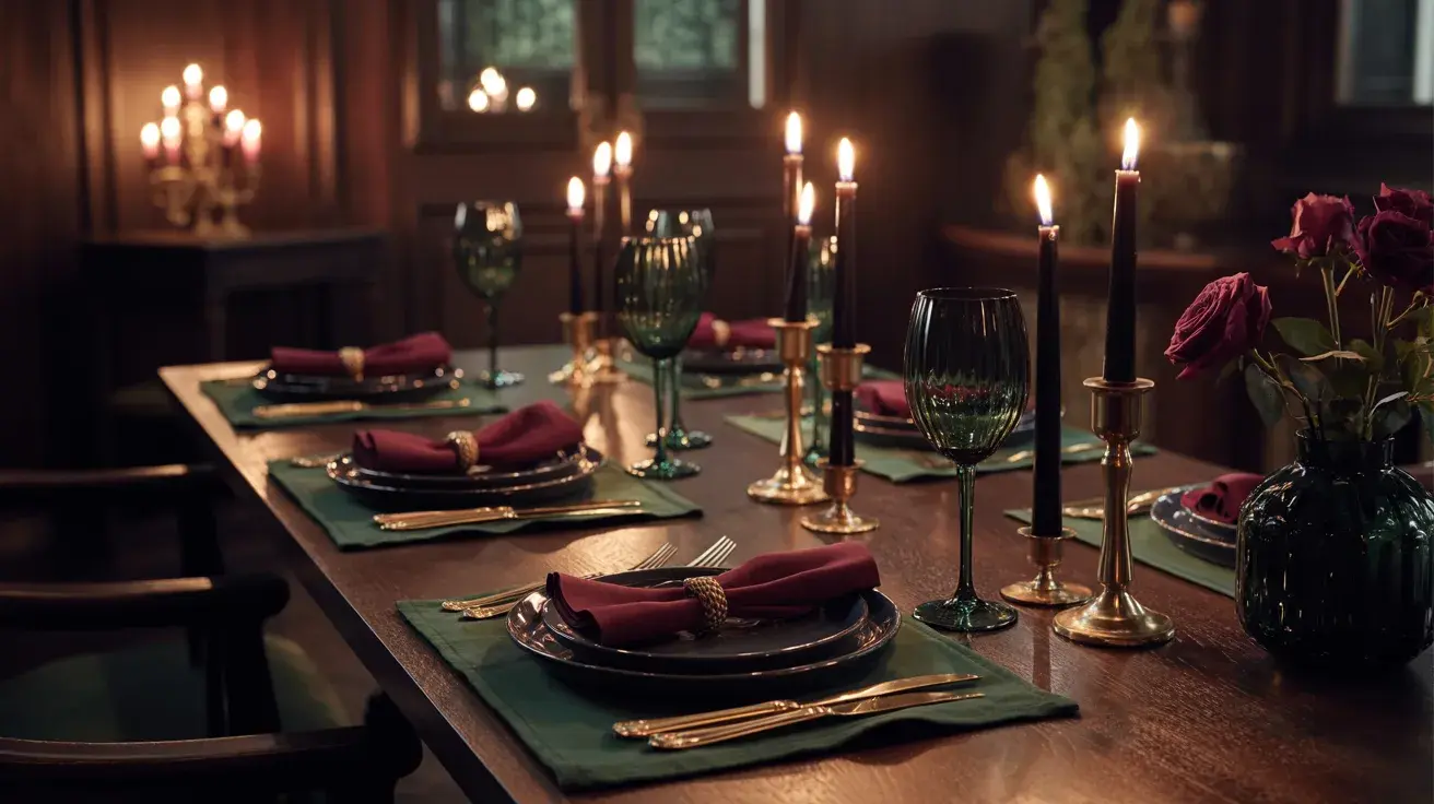
Emerald + Burgundy + Black Dark, layered, and genuinely striking. This palette belongs in a venue with high ceilings, candlelight, and good bones.
Styling tip: Use emerald as the dominant color here, not black. Black as a supporting tone adds depth; black as the lead color overwhelms emerald and burgundy.
17. Industrial Romance
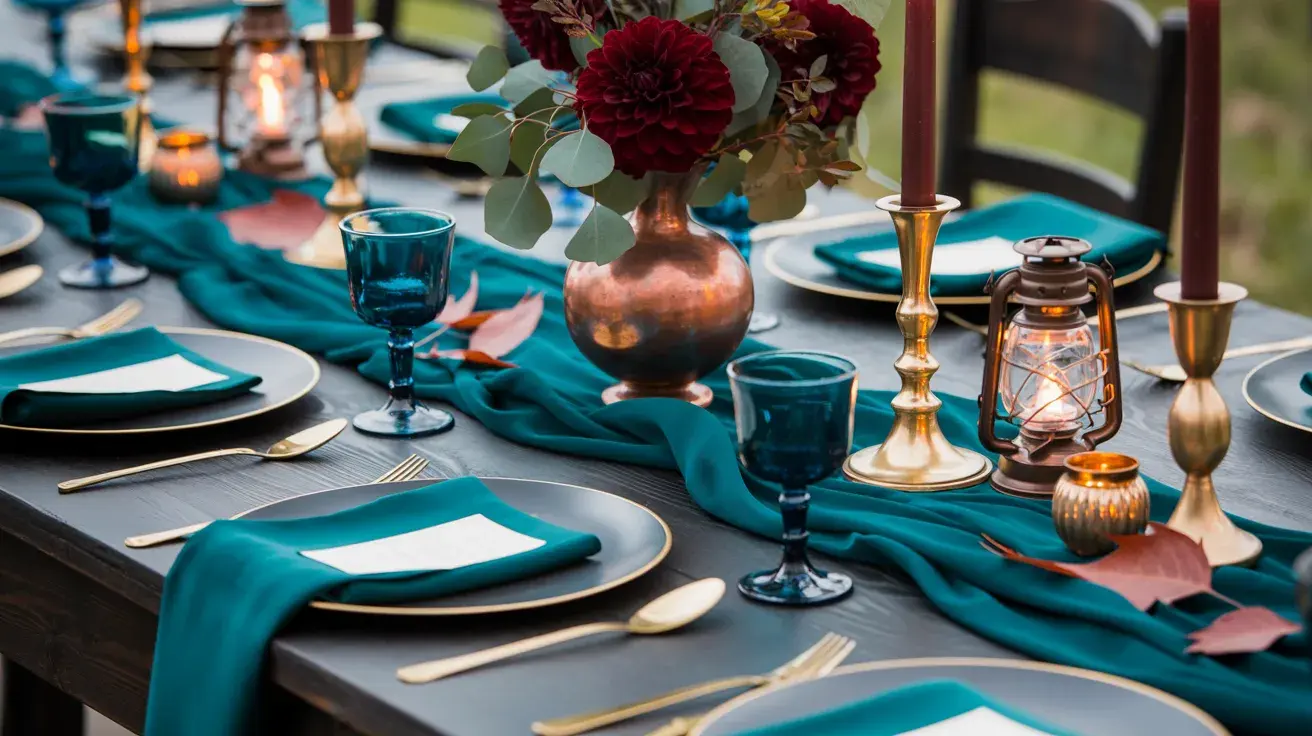
Deep Teal + Copper + Charcoal Unexpected and memorable. Deep teal is one of those colors that reads differently in every light, green, blue, and almost gray at various points in the evening.
Styling tip: Copper here should be warm and slightly aged rather than bright and metallic. Think antique hardware, not copper pipe.
18. The Long Table Dinner
Aubergine + Navy + Metallic Gold: Two dark shades and one metallic. This is a high-risk, high-reward combination that works when the gold is used sparingly, and the two darks are clearly distinguishable in person.
Styling tip: Aubergine and navy can bleed into each other in low light. Separate them with gold details, place cards, candleholders, and table numbers, so the difference reads clearly at the table.
19. The November Wedding
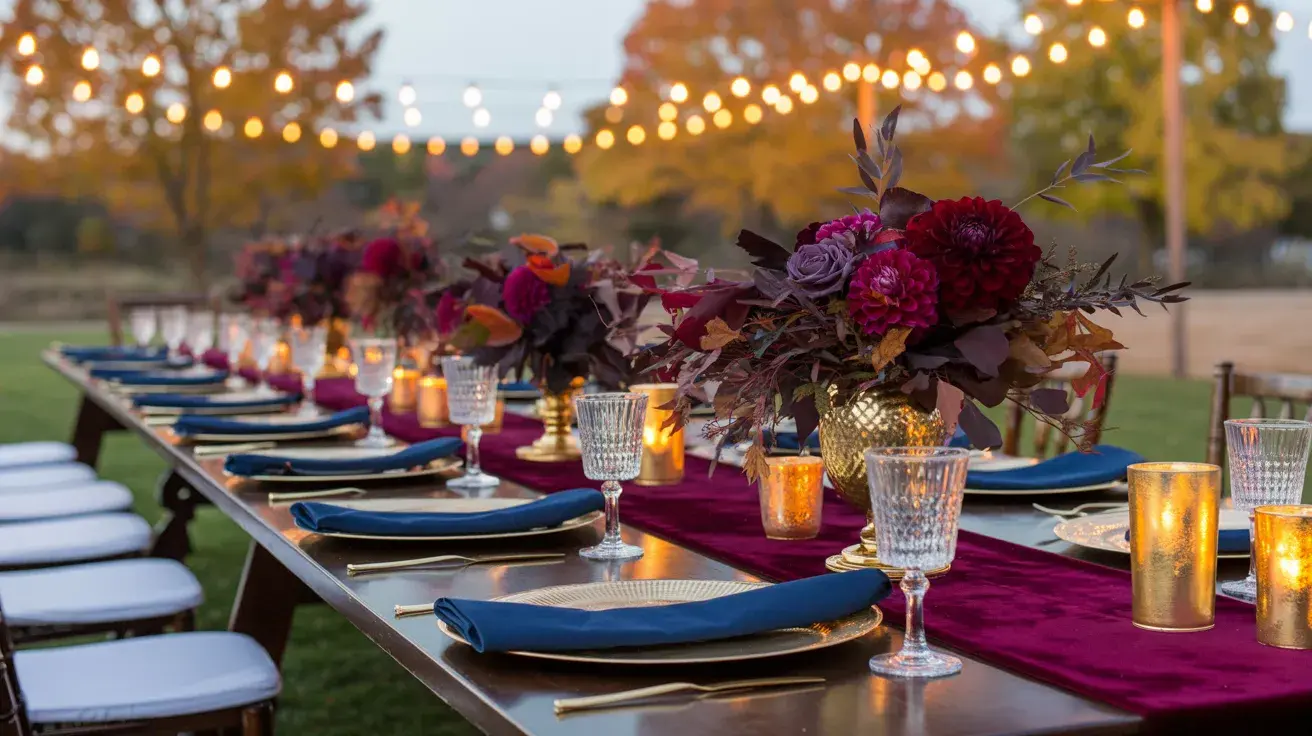
Forest Green + Black + Ivory Clean lines, strong contrast, and completely at home in late autumn. This palette works in luxury venues just as well as it works in historic ones.
Styling tip: Let ivory do more work than you think it needs to. Ivory linens, ivory candles, ivory stationery, the lightness creates space for the green and black to breathe rather than swallow the room.
20. Cold Water
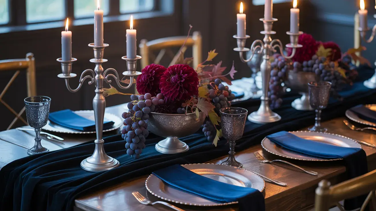
Midnight Blue + Silver + Wine Unusual for fall, but completely of the season when you think about cold autumn nights and dark skies. Silver here reads as moonlight rather than winter frost.
Styling tip: Avoid bright silver; it reads bridal in a dated way. Oxidized silver or pewter tones sit far better alongside midnight blue and wine.
21. The Last Fire
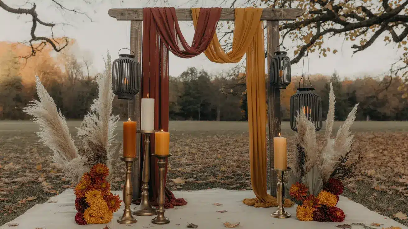
Charcoal + Rust + Mustard. This palette has a slow-burn quality. Nothing is bright; everything is warm. It looks exactly like the end of October should look.
Styling tip: Balance the warmth of rust and mustard with cool charcoal linens as a base. Without the charcoal anchor, this palette can start to look too close to a Halloween color scheme.
Soft and Romantic Fall Palettes
These palettes sit in the part of autumn that most people overlook, the softer, quieter side of the season. Light through turning leaves, the last garden roses before the first frost, mornings that still feel warm.
22. The Garden at Dusk
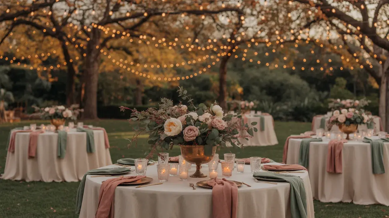
Dusty Rose + Sage + Cream. Possibly the most requested fall palette of the last few years, and it earns that. The three colors work together without any of them overpowering the others.
Styling tip: The dusty rose has to be genuinely dusty, muted, and pinkish-brown rather than bright or baby pink. Pull a swatch next to your sage before ordering bridesmaid dresses.
23. September Light
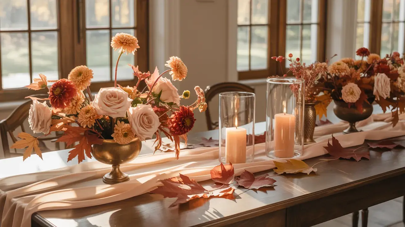
Peach + Champagne + Rust Warm and sun-washed, this palette is perfect for early autumn weddings when the light is still golden and long. Rust keeps peach from reading too summery.
Styling tip: Use rust only in ribbon, candles, or small floral touches. As a dominant color alongside peach, it can tip the palette toward orange.
24. The Quiet Romance
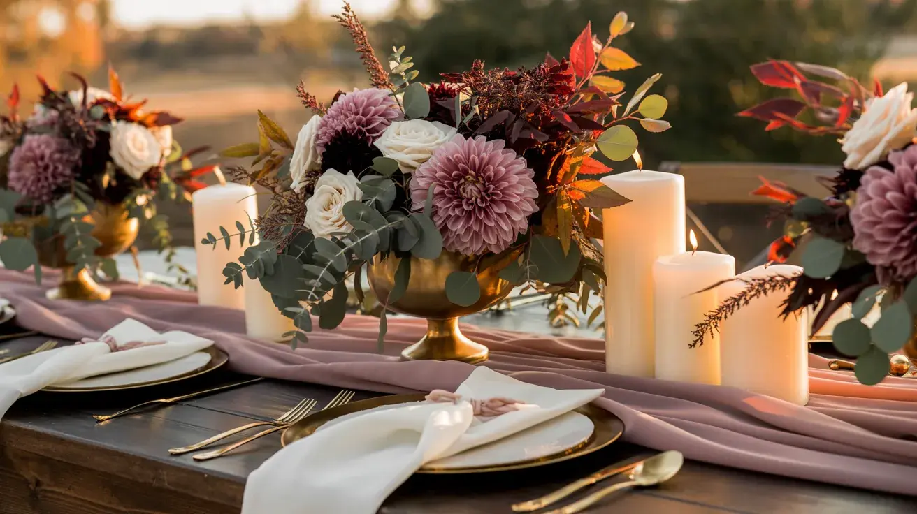
Mauve + Ivory + Green Mauve is having a long-overdue moment in weddings, and it works particularly well in the fall when everything is slightly deeper and warmer.
Styling tip: Choose a mauve that leans warm (pinkish-brown) rather than cool (pinkish-gray). The warm version sits far better against autumn florals and fall foliage.
25. Soft Ground
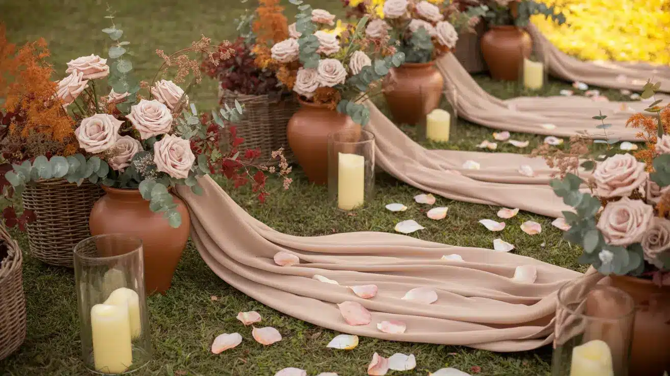
Blush + Terracotta + Beige Light on top, warm on the bottom. Blush reads differently when it lives alongside terracotta; it picks up warmth it doesn’t have on its own.
Styling tip: Layer this palette through texture as much as color. Linen, rattan, unpolished ceramic, and dried florals all carry this palette better than polished or formal materials.
26. The Mist
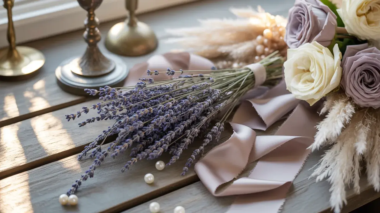
Soft Lavender + Taupe + Cream Quiet and slightly unexpected for fall. Lavender usually reads as spring, but paired with taupe and cream, it takes on a cooler, more muted quality that works beautifully in October light.
Styling tip: This palette needs warm lighting to stop it from reading cold. Candlelight and amber-toned uplighting are non-negotiable.
27. The Warm Neutral Edit
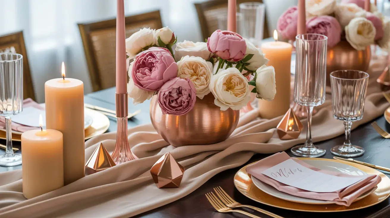
Rose Gold + Neutral Pink + Sand Modern and warm, this palette lives in the space between blush and metallic without fully committing to either.
Styling tip: Rose gold in hardware and stationery foiling looks expensive. Rose gold in fabric tends to look shiny and dated. Keep the metallic tone in the details only.
28. Early Evening
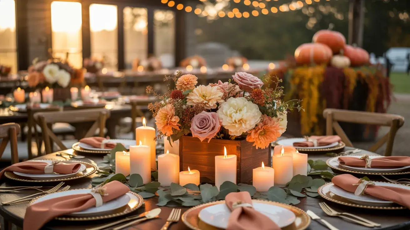
Coral + Muted Orange + Cream Coral in fall sounds like a risk, but muted coral, the kind that leans toward peach-salmon rather than bright orange-pink, sits comfortably in an autumn palette alongside cream.
Styling tip: The success of this palette depends entirely on the specific shade of coral. Bright coral = summer wedding. Muted, warm coral = early fall. Order fabric swatches before anything else.
Unique and Unexpected Fall Palettes
These are the combinations that make people stop mid-scroll. They break the expected autumn rules in the best way, and they’re far more wearable than they look on paper.
29. The Art School Wedding
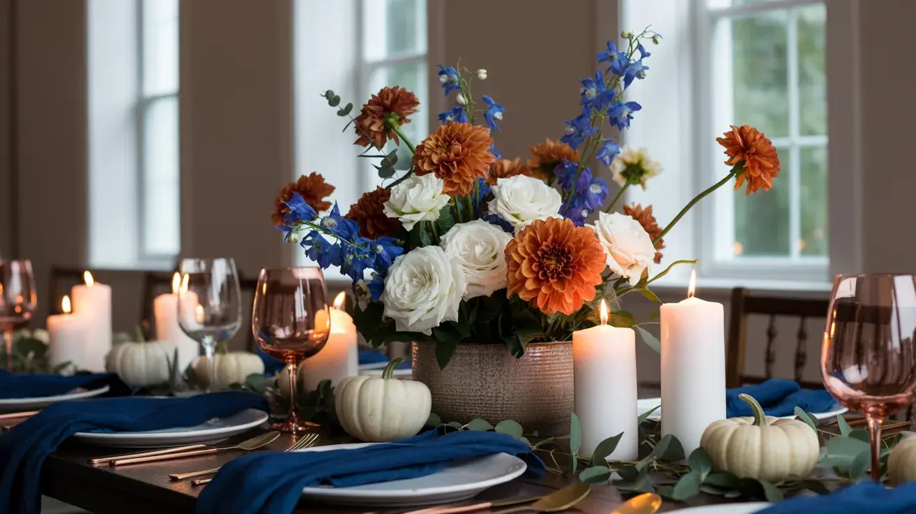
Blue + Burnt Orange + White are complementary colors straight off the color wheel, and yet completely unexpected at a wedding. The contrast is bold but not chaotic when white is used generously as a buffer.
Styling tip: This palette lives or dies by the specific blue. Cornflower blue gives it a playful quality; navy gives it weight. Decide on the mood you want before pulling in other elements.
30. The Wildflower Edit
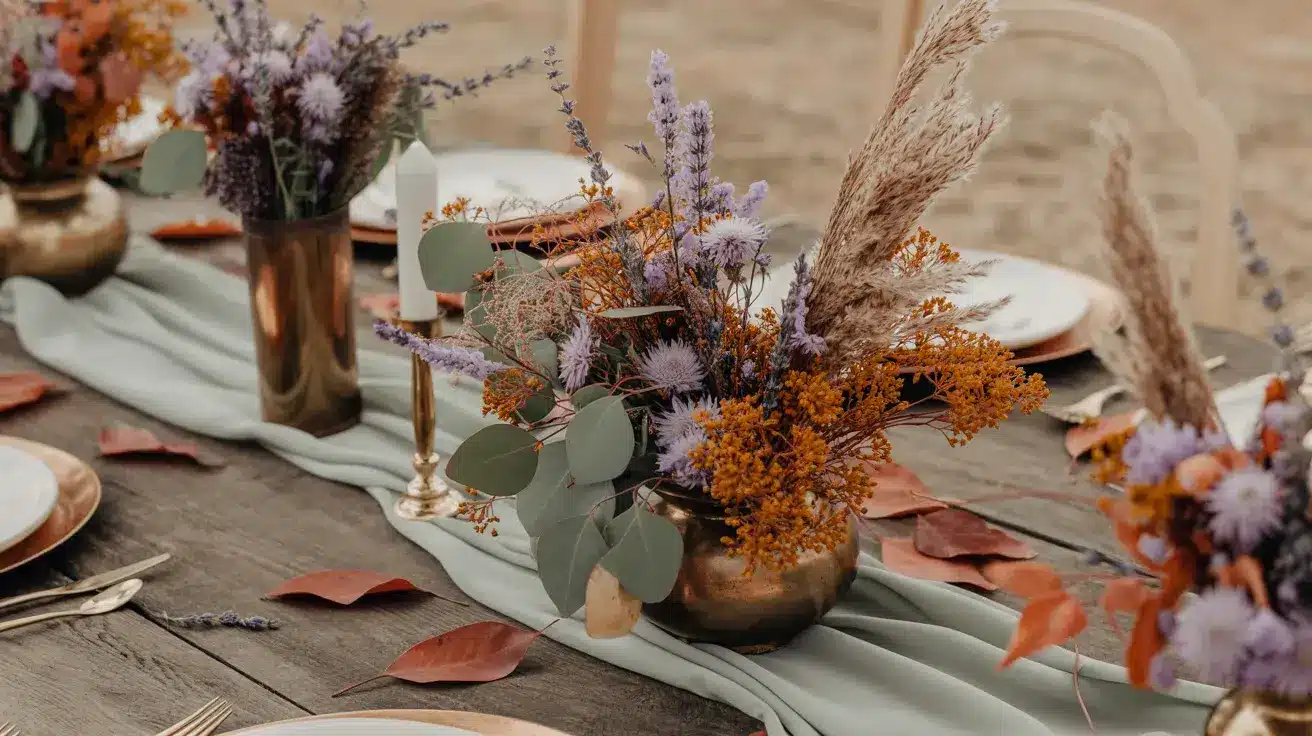
Lavender + Rust + Sage: Three colors that have no obvious reason to work together, and yet they do, completely. Lavender cools down rust; sage sits between them as the neutral, doing overtime.
Styling tip: Let rust show up only in dried florals and small details. Lavender and sage carry the softness; rust gives the palette its autumn anchor without taking over.
31. The Unexpected Guest
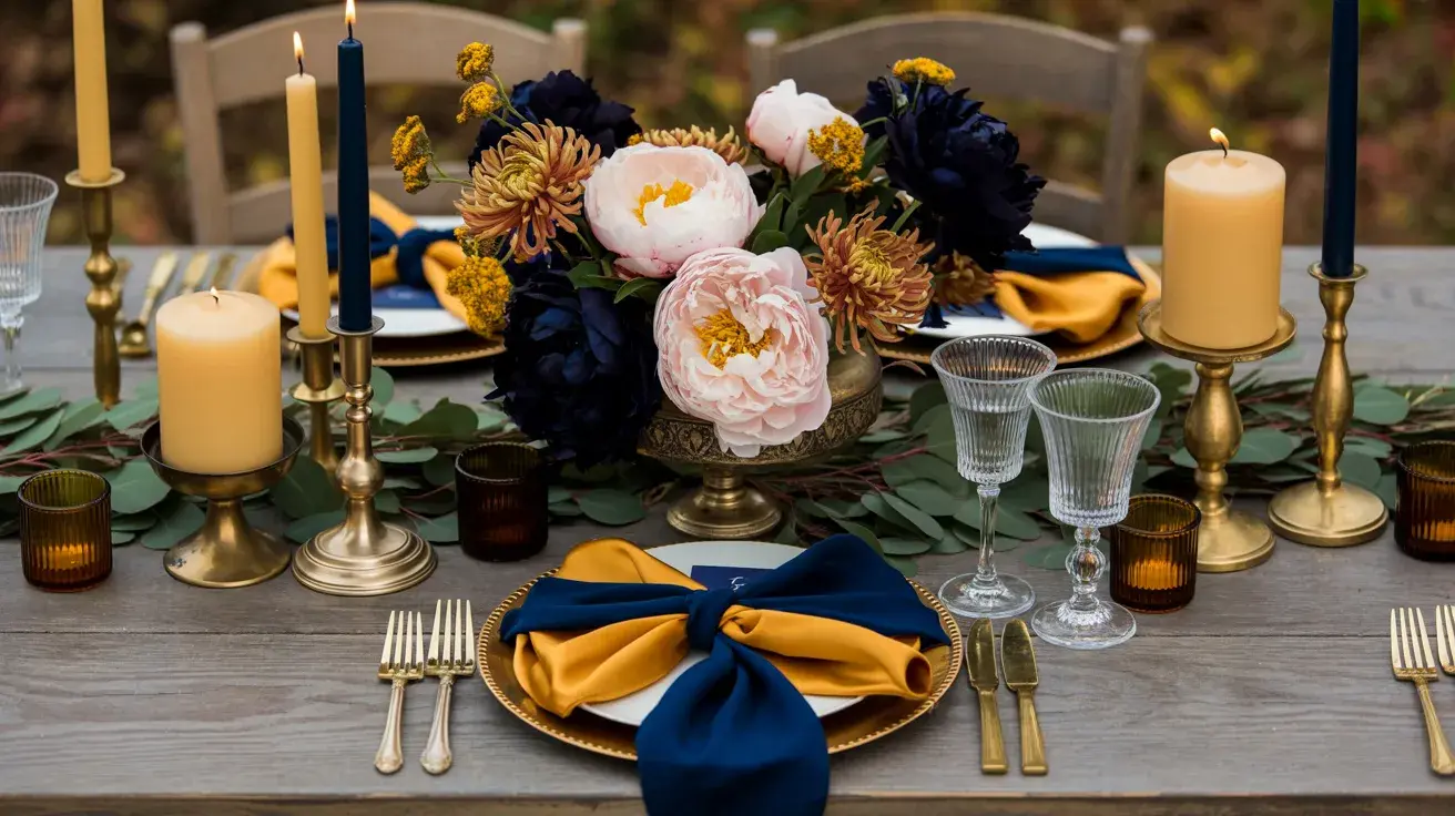
Mustard + Navy + Blush: Three colors that seem like they come from completely different palettes, and that’s exactly why it works. The contrast is surprising, and the combination of photographs is beautiful.
Styling tip: Use navy as your dominant color in this combination. When mustard or blush leads, it tips the balance and loses the boldness that makes this palette interesting.
32. The Black Tie Garden Party
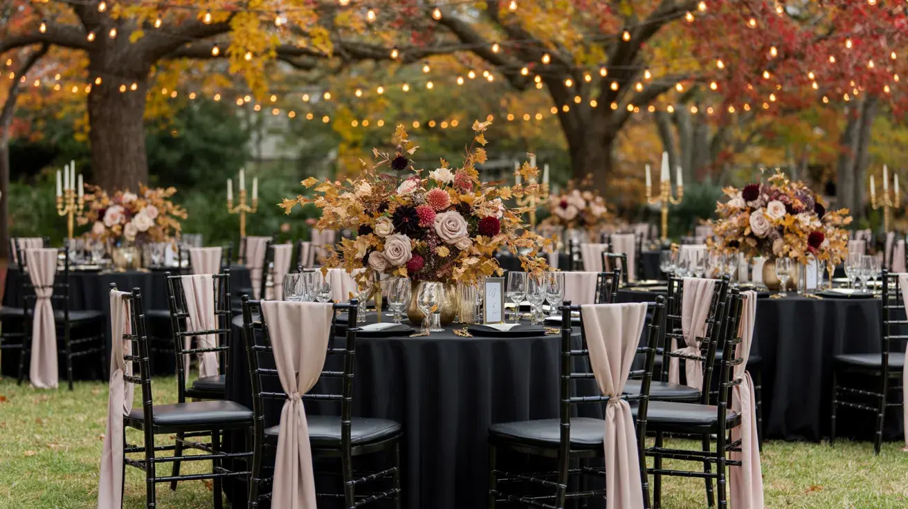
Blush + Black + Gold Soft meets sharp. Blush on its own can feel too delicate; black on its own too stark. Together with a thread of gold, they create something that reads both formal and romantic.
Styling tip: Keep black to hard surfaces and paper goods. Black florals are a bold choice that works in editorial photos but can feel heavy in a room full of guests.
33. The Summer Holdout
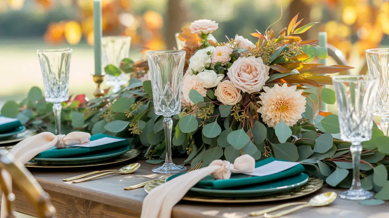
Emerald + Peach + Cream Peach in a fall palette sounds counterintuitive, but emerald grounds it immediately. This combination works for September and early October weddings where summer hasn’t fully let go.
Styling tip: Use peach only in florals, ranunculus, garden roses, and dahlias. As a fabric color alongside emerald, it can read too bright; in blooms, it reads warm and seasonal.
34. The Cool Season
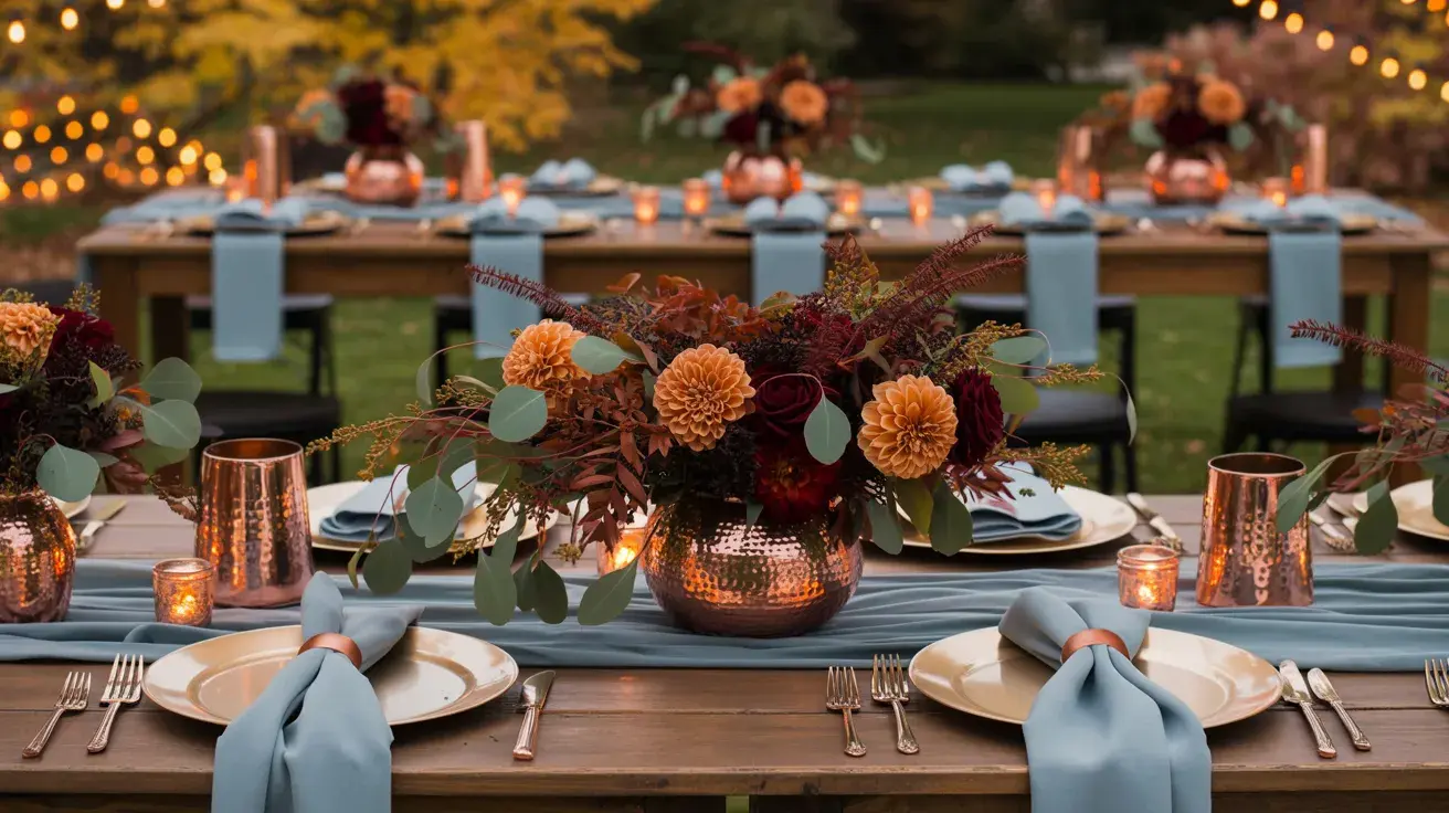
Dusty Blue + Copper + Beige Blue in autumn is always a conversation, and dusty blue earns its place here. The copper warms it up; beige keeps it from looking wintry rather than autumnal.
Styling tip: Dusty blue bridesmaid dresses pair extraordinarily well with fall foliage in photographs. This is one combination where the outdoor backdrop does work; the florals alone cannot.
35. The Wine Bar Wedding
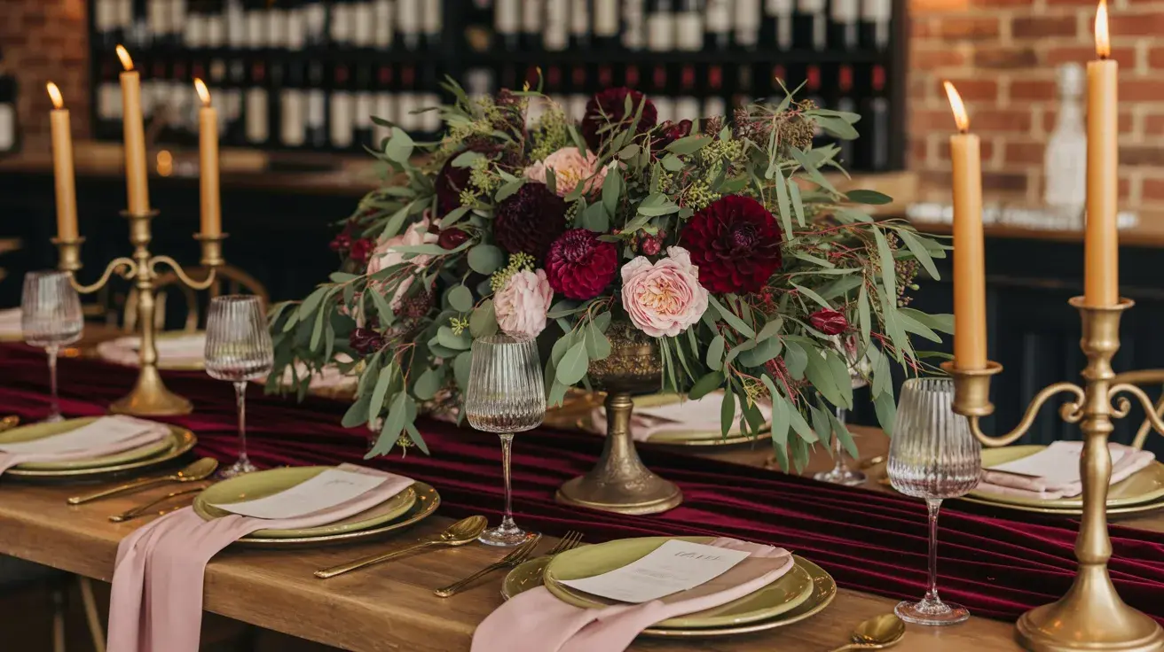
Olive + Burgundy + Soft Pink. Three colors you wouldn’t necessarily put together on purpose, and yet they look like they were made for each other. Olive is the secret ingredient that makes burgundy and soft pink work without going saccharine.
Styling tip: Use olive heavily in the greenery and foliage, not in fabric. Olive dresses are a strong look; as a background botanical, olive is the quiet detail that makes the whole palette feel considered.
Quick Fall Wedding Color Palette Finder
Not sure where to start? This quick palette finder makes it easy to match your wedding vision with the perfect fall color combination. Just follow the vibe that feels most like you.
| If you want… | Try this palette |
|---|---|
| Classic with a rich feel | Burgundy + Gold + Forest Green |
| Earthy and low-key | Terracotta + Sand + Olive |
| Dark and dramatic | Black + Plum + Gold |
| Soft and romantic | Dusty Rose + Sage + Cream |
| Something unexpected | Blue + Burnt Orange + White |
| Warm and modern | Copper + Cream + Olive |
| Late fall or November | Forest Green + Black + Ivory |
| Early fall or September | Peach + Champagne + Rust |
| Bold but not heavy | Mustard + Navy + Blush |
| Nature-forward | Clay + Warm White + Eucalyptus |
Once you’ve found a palette that clicks, use it as your foundation and build around it with textures, florals, and details to bring your fall wedding vision to life.
A Note on Trends vs. Timelessness
Two 2025 color directions are worth knowing about. Pantone’s Color of the Year, Mocha Mousse, is a warm gray-brown that works as a quiet anchor. Its influence shows up in Studio Pottery, Slow Living, and The Gray Area.
The 2025 Wedding Color of the Year, Verona Sunset, is a warm Italian-sunset orange closer in spirit to Harvest Without the Hay Bales and September Light than to pumpkin orange. Both point in the same direction: muted over saturated, layered over matched, textural over flat.
What tends not to age well: overly saturated single-color schemes and anything that leans heavily on a trend-specific material that will look very 2024 in five years.
When I’m working through a palette with someone, the question I come back to is this: would you want this in a framed photo on your wall in fifteen years? If the answer is yes without hesitation, you’re done.
Your Palette Is Already in There: You Just Have to See It
Fall gives you more to work with than any other season. The hard part was never the color options; it was knowing where to start and what to do with them once you had a direction.
Go back through the popular fall wedding color palettes that made you stop scrolling. Notice what they have in common. That pattern is your palette telling you something.
Pick the mood that feels most like you both, anchor it with one strong color, and let everything else follow from there. The rest, flowers, fabrics, table settings, fall into place once that decision is made.
Frequently Asked Questions
What Is the Trend in the Wedding Palette 2026?
Muted jewel tones, earthy neutrals, and unexpected pairings (like blue + rust or blush + black) are leading trends. Couples are leaning toward layered, evergreen palettes rather than overly seasonal or cliché colors.
What Colors Look Luxurious in a Wedding Ceremony?
Deep tones like emerald, burgundy, navy, and black paired with metallics like gold or champagne create a luxurious feel. Soft neutrals like ivory and taupe also add elegance when used with rich options.
Should I Use Rustic Colors for a Wedding?
Rustic colors like terracotta, olive, and warm browns work beautifully if they match your venue and vibe. Keep them balanced with softer neutrals to avoid looking too heavy or overly themed.